Supernatural Tutorial - Tumblr Posts
SCREENCAP PICSPAM TUTORIAL
Yes, another tutorial! This was a request from an anon; they wanted a tutorial of how I did this Supernatural Picspam, and I am going to actually do it, because I actually like making tutorials ^_^ So just to be clear, I will not be doing the exact same pictures and color scheme because I didn’t save the PSDs for each of those pictures, but it will be pretty much the same.
I am showing you how to make a color-scheme picspam, made entirely of screencaps from Supernatural:

First thing you need is a template. There are plenty you can find online to download, especially on tumblr; but I am going to give you one for this spam.
I use different templates for each picspam I make, and for the original post I used the picture sizes above and made it for sixteen pics instead of the eight I am doing right now.
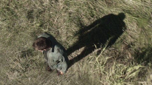
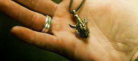
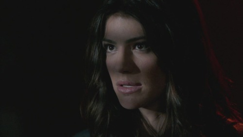
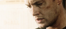
For this kind of picspam I usually either cap my own screencaps from HQ videos that I have of episodes, or I get them online. For these caps I used homeofthenutty.com, and the episode I took the caps we are using for the tutorial is season 4, episode 1.
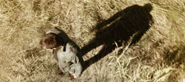
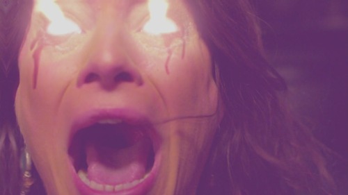
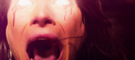
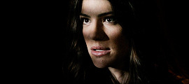
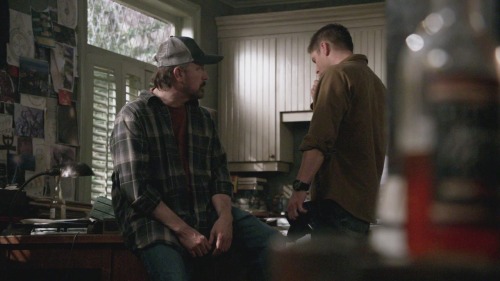
Now, open up the first cap you’re going to use:
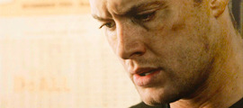
First things I usually do are to duplicate the background layer; set the blend mode to screen and mess with the opacity until I find a lightness I like. Then I made a black and white gradient map, set the blend mode to soft light, and the opacity remains at 100% for this one.
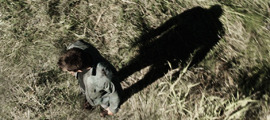
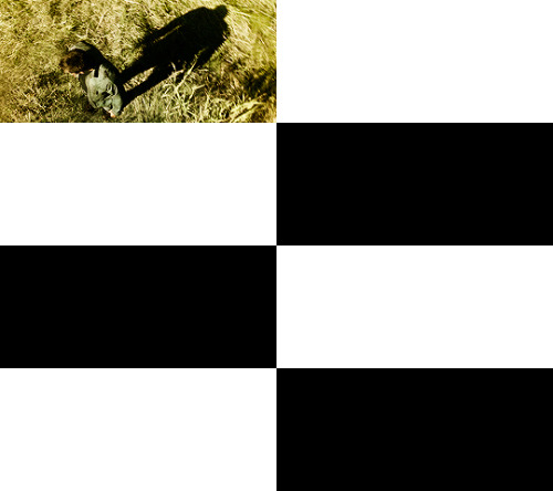
Now a selective color, focusing on reds. Cyan -34, Magenta -29, Yellow -12, Black 0. Now make a new layer, blank and pick a round soft brush and a color. This color will define the color scheme for the whole picspam, so pick something good.
I made a duplicate of the layer and erased some of the middle parts I colored before. I used this #e0bea3 for both layers, and set the blend mode to soft light.
Now make a Hue/Saturation adjustment layer, with saturation +24. Then a Vibrance adjustment, vibrance +16 & saturation +11.


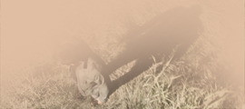
Download those and add them on top of the cap. The first one should have a blend mode of soft light, and an opacity of 38%. The second is also soft light, but 100% opacity. Now another black and white gradient map; soft light blend, 95% opacity.
Lastly, I stamped the layers (ctrl+alt+shift+e) and sharpened. Filter > Sharpen > Smart Sharpen, then make sure that More Accurate is ticked, Amount 500, Radius 0.3 and Remove: Gaussian Blur. And then a color balance if you need it, just for more toning. I used midtones only, -9, +22,+22.
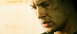
Then add it to the template. And rinse and repeat.
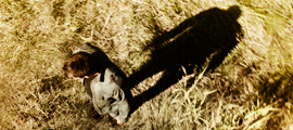
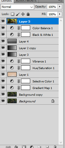
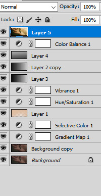
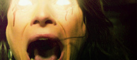
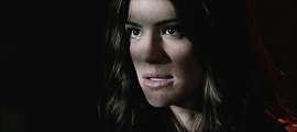
Here are my layers for this cap, and the results:
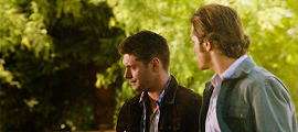
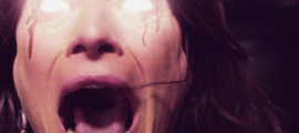
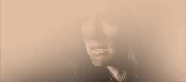
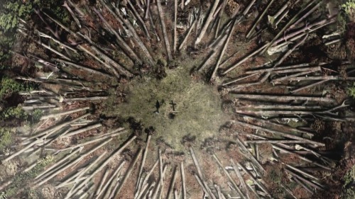
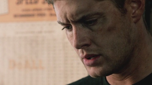
This one ^^ required some more toning and darkening than the others.
I started with the darkening and contrasting. A black and white gradient map set to the soft light blend mode. Then another at a lowered opacity, then a selective color, focusing on reds. -34,-29,-12,0; set to absolute.
Then a new blank layer, the same yellow-orange tone as before (#e0bea3) This was how I colored it:
Then set the blend mode to, guess what? Yeah, soft light. Did a hue/saturation and a vibrance layer, just like on all the other caps. And the gradient layers I told you to download from before. Now it looks like this:
Now for the real trick, making it yellow/green without making it look terrible. Make a color balance adjustment, midtones only; -47, +31, -30. Then another one, only midtones again; -17, +12, -31.
Then I stamped (ctrl+alt+shift+e) and sharpened, same as before. Then I added a blank layer and painted in black on the right side, and added a subtle curves layer on top.
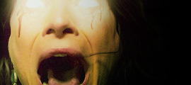
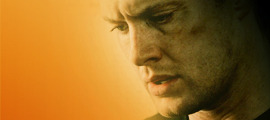
And add it into the template!
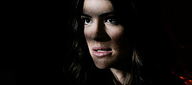
Looking good so far ^^
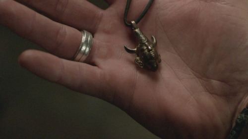
Ruby’s cap was different too; for her I duplicated the background layer and set the new duplicate to the blend mode screen. Then I stamped it and sharpened. Next a gradient map, soft light black and white color scheme.
I wasn’t happy with the contrasting so I duplicated the gradient one more time. And I did some toning; just a vibrance and some selective color.
Next the famed soft light color layer.
And then the same gradients as before and some black for the right side too.
I did another vibrance, (+38,+10) and a color balance (midtones: -17,+15,-10) and a selective color (reds: -32, +36, +35, 0)
Final result ^^
This one I just duplicated the background and set the duplicate to screen. A vibrance layer, a color balance for more green, and then sharpened it.
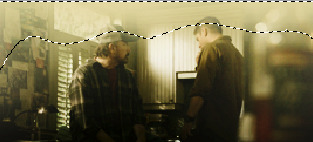
Follow all steps from the first picture; this time I added a blank layer on top and used a yellow-green color for the top part. I wanted there to be a lot of light; here is my selection for where I put the color (#e2d5a0)
Color balance and gradient maps are your best friends!
Same steps as before! Only this time, I used an extra color layer (#e17813) I placed the coloring like so:
Blend mode = screen, Opacity = 44%.
Hue and saturation, vibrance then the same gradient layers we’ve been using all along.
I added another gradient map on top for some more contrasting; soft light blend mode and 43% opacity. Then I used blank layers, a soft brush and absolute black to add some darkness to the right side. Then a color balance on top of everything for the green-yellow tones of the picspam’s color scheme.
That’s it! Now add them to the template if you haven’t already and save it.
At the very end, I did add a vibrance and a selective color on top of all of the layers on the template. Vibrance +11, +3; Selective Color, blacks +5.
No PSDs this time, but for more screencap editing help check out my other tutorials. Especially the one I did for Sam.