Lithograph - Tumblr Posts
![Howard Hodgkin [UK] (1932-2017) - Bleeding, 1981-82. Lithograph In Colours Using Tusche Washes, With](https://64.media.tumblr.com/cb04950bb4f81013edfa4a1dbdfe39cd/4740cf2b72cd7931-fe/s500x750/2caac34cf333080fba0ce006bd0dbdcb87ea5921.jpg)
Howard Hodgkin [UK] (1932-2017) - ‘Bleeding’, 1981-82. Lithograph in colours using tusche washes, with hand-colouring in gouache (91.9 x 152 cm).
ocean in a seashell


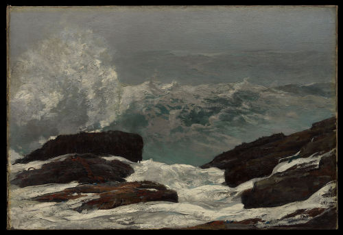
here is an ear hear, victor hernández cruz // sidelines, phoebe bridgers // laura & the beehive, the wonder years // sea shell, amy lowell // the song of the sea (young woman listening to a seashell), unknown // miss gladys lawrence - the seashell, frank eugene // here's why seashells sound like the ocean, caroline bologna // maine coast, winslow homer
![WILLIAM KENTRIDGE /HYACINTHS / 2020[42 Lithographs Laid On Unstretched Canvas | 64 7/8 X 59 ]](https://64.media.tumblr.com/e2a7827e360dff2488e134cff21b9fcf/595f0ef72554812b-2a/s500x750/1a17e4f1bcdad588a24783d95ea2db406d384e10.jpg)
WILLIAM KENTRIDGE / “HYACINTHS” / 2020 [42 lithographs laid on unstretched canvas | 64 7/8 x 59 ¾”]

Brianna's Got Her Gun. Stone Lithography for Ben Moreau's lithography class 2011 at WWU.
Goddamn I hate lithography. I have no patience for a medium that precludes sketching and re-working, which you may find amusing as I am happily hacking away at another block of irrepareable linoleum. but by the time I'm carving a block I know about exactly what I want the lines on it to do and where the spot-darks and highlights are going to dance with the white-space-that-release the-pressure-of-dark and the false printing that makes the whites human again.
I'm not sure if I can explain putting whites in to release pressure, but the idea that that was why I was doing it already, came out of learning about PNW native art which uses that principle to keep things from getting too heavy. not sure how else I can explain it with out looking like a person pointing at pictures tacked to my wall and linked by string.
anyway, this iconic-as-all-hell image was originally, and best, as a photograph my uncle took of my cousin in her prom dress. this image was apparently helpful in my entrance into the BFA program because Garth liked it. but, man I hate lithography.
hate it.

ok, so this piece is one that I am still fairly proud of, it is just a printed digital photograph of me man-handling a bright orange saddleback gunnel, but I managed an edition of six and no major fuckups and that's pretty big for me.
you can't really hold these guys, they have to want to hang out on your hand, but they're pretty friendly and so they did want to hang out on me fairly often when we cleaned the tanks, although I don't think Noel my boss was too happy with me sticking my hand in the tank and taking this shot.
interesting note, I was a good volunteer at the marine Life Center partly because my hands do not get cold very fast so I could spent a lot of time with my hands in the tanks, either holding fish for visitors to pet, or more often whilst cleaning tanks.
back on topic, this print was my first exposure to using CMYK processes, the image itself was a digital image, which was split into CMYK channels (I used vibrance and some other things to beef up the colors first, it was a little more dull originally and I was worried about that getting muddy and lost) and then each channel was made into it's own individual image, and converted into a bitmap to make it into ben-day dots each image with a particular orientation of dots so that they did not overlap but were next to one another. this was then printed via laser printer onto four plastic sheets and then ink was applied to the sheets and then the paper through a process marginally resembling lithography.
the ink on each plate only stuck to the places where there was already black toner, and I learned that in printing CMYK is both a description of the inks used, and the order in which they must be applied. cyan is darker/more visible, than magenta or process yellow, and so putting it down first allows the printmaker to align the subsequent colors more easily.
because I managed to do every step correctly and accounted well for my time this was one of the best of these in my class, which is a surprise, because any of the photography students could have (I hope anyway) crapped out a better color photograph in their sleep, they all however, opted to get creative in their process.
if there is a thing I have learned as a printmaker it is this thing, trust your process and be diligent. I can't always do it, but I think I did ok here.

Château de Pau (1843) lithograph by Eugène de Malbos. Bibliothèques de Toulouse.

Hector Berlioz (1845) lithograph by August Prinzhofer.
I went to Sydney for Alphonse Mucha
by: Icie
One thing to know about me, I was an interior design major back in my home country. I absolutely sucked at it, but I fell in love with Art History. In that minor, our professors taught us about different art styles through the ages and bit by bit I saw the progress of art through the ages. I loved the OG Gothic Style, Romanesque, was disillusioned with Baroque and Rococo from the west... It was too Western focused and it didn't interest me as much (because I was an Asian kid) until we got towards the end of the 19th century where the grandparents of weebs (of which I am a part of) hailed from and Japonisme was a thing. Japonisme inspired so much beautiful art and it triggered a domino effect that ultimately led to Art Nouveau where Alphonse Mucha was a main character.

This was it. My favourite art style! I can never go back to loving other art styles after discovering Art Nouveau. It spoke to me about how feminine it was and it awakened something from my mostly masculine soul. I wanted to see more of these beautiful girls surrounded by flowers and stars, wearing kimono-inspired clothes in pretty pastels. The macaroni hair only added to the romanticism of it all. This is what love is like, but in art form!

Fast forward to 2024, The Mucha Foundation collaborated with the Art Gallery of New South Wales to host over 200 of this master's works which was "the most comprehensive exhibition ever seen in Australia of this visionary artist's work". I had to see it. I needed to see it! I am a big fan of Mucha and Art Nouveau, and one of my dreams was to go to Paris, Brussels, and Prague for all of the beautiful swirly-whirlies. Being a Brisbanite, I was exited. Please come to my city! Please, please, please! But AGNSW said "sorry, it's exclusive to Sydney."
Dammit. It's off to Sydney I go. I donned my Sailor Moon dress, packed my bag for a 3 day trip with my partner just so I could see this legend's works and boy, I was not disappointed. I learned to love Mucha and his works even more. We landed in Sydney, didn't check in our hotel, and went straight to the main quest:


Outside, they had this big banner of Mucha's name. Inside was this glorious area that showcased Summer (left) and Rose (right). Oh wait, the exhibit is next door. So we went to the more modern building, down two floors, bought tickets, and enjoyed the art.


In the newer building next door, I was treated to pre-art nouveau Mucha. We learned about what his life was like before his popularity. He designed some clothes for a theatre, hung out with everyone's buddy Paul Gaugin, Ludek Marold and Annah the Javanese. The tour guide said, "if he wasn't a painter, he would've been a great photographer".
Then we were treated to the meat of the exhibit: the Sarah Bernhardt stuff, his lithographs, his sketches, but what struck me most were his concept art to reality. (Excuse my phone's shadow. For some reason, AGNSW decided to put these works on a 45° angle under bright lights. The girl beside me even said "fucking glare!" and I wholeheartedly agreed.)


We were treated to so many wonderful works and I cried when I saw parts of Le Pater. I'm an atheist but this made me think that maybe there is a god. Maybe. But still, beautiful artwork that left me speechless.


I got to stand next to my favourite work of his: White Star. Joy!


At the end of the exhibit, the tour guide talked about how Mucha who was somewhat influenced by Japan, now influenced Japan. Now we come full circle with anime and manga characters depicted in art nouveau styled paintings and posters. Oh boy, we had our Lord Yoshitaka Amano's works in the gallery as well. I was so lucky to see works of my two favourite artists in one day!


It was almost 2PM by the time we finished the tour. We spent at least 4 hours in the gallery after landing just because I fangirled and was willing to spend money on Mucha. Yeah, I bought stuff. A reproduction of Alphonse Mucha's original "Documents Decoratifs" which focused more on his industrial design work (jewellery, cutlery, furniture etc) which I rarely see on the internet, a set of badges and make-up from Japanese brand MilleFée.


I went to Sydney for Alphonse Mucha and it was worth it. I end this rabid fangirling with the parting words of the Art Gallery of New South Wales' tour guide: Mucha's style has never been as well loved and as well represented as it is in Japan.