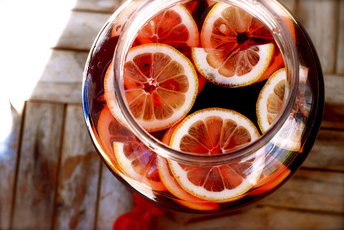
Color Reference - Tumblr Posts


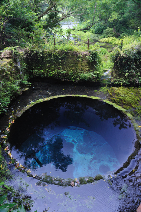
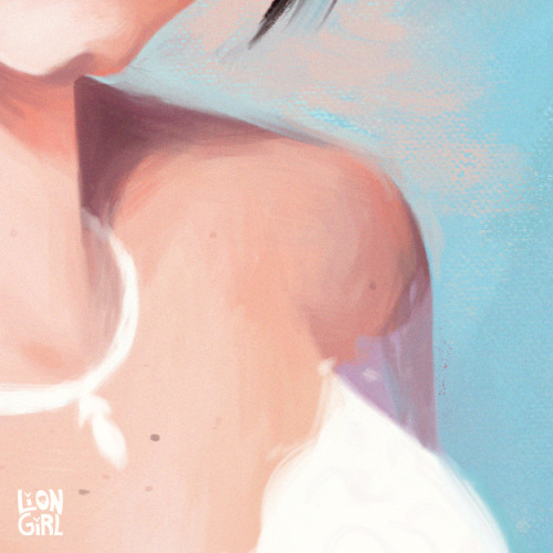
On the Road (by Justyna Zduńczyk)
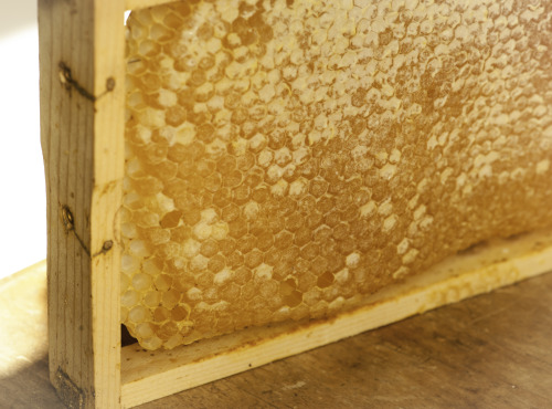
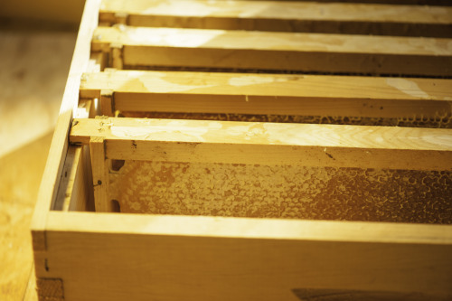
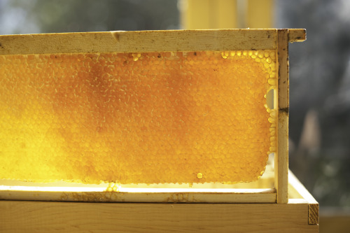
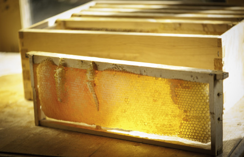
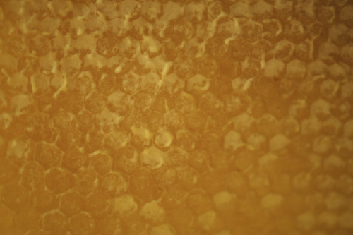
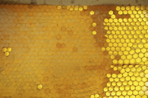
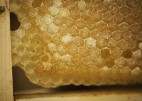
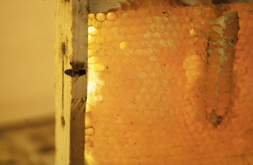

This was the first time I tried the honey from the hive, having smelt it on and off for the past two years. I wanted to wait until the bees had sufficient supply tucked away, and even now, took only a few frames. It is so good: rich and spicy and incredible thick, I cut out an inch square and ate it like a bear, with comb in my paw. They work so hard to make this, it is truly precious stuff, full of the essence of every plant they visit. Buzz buzz…


I was walking home from Duke campus last week on a particularly chilly day when an entire flock of cedar waxwings landed in a berry tree near the path. There they were, in a feeding frenzy, while the rest of us were freezing in the 20 degree F weather. They are so fun to watch, especially with all those berries in the background.

Love it ·q·
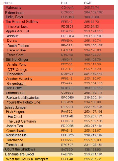

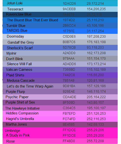
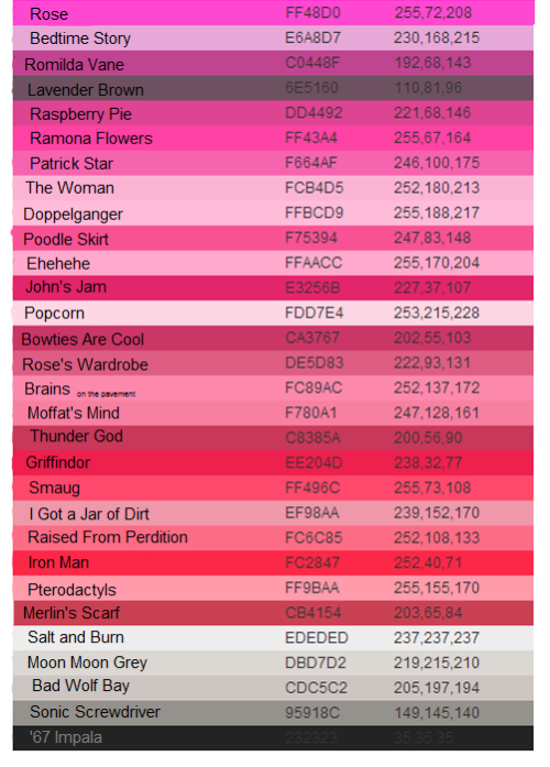
I HAVE FOUND EVERY COLOR CRAYOLA HAS MADE INTO CRAYONS AND RENAMED THEM BASED ON SOME POPULAR TUMBLR FANDOMS.
YOU’RE WELCOME.
Some of the shades in between got named weird because I ran out of ideas. I worked on this for a week, guys.
Based on this post.

Try as I might, Tumblr wouldn't bring up these accounts for a proper reblog when I searched the usernames. Apologies for being unable to reblog!


A tip for blending when painting digitally: use a transition color! I quickly made this when my brother asked for art advice while I was working on a painting for my best friend. (I was watching a lot of makeup videos to pick out her gifts).
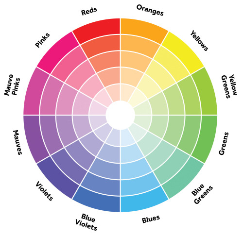
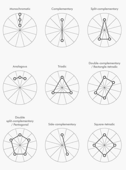
A simple guide to picking a great color palette. No matter what the colors are, using colors that are certain distances from each other on the color wheel result in a great contrast of colors. The simple color schemes shown above are used in the most popular logos, posters, websites, paintings, and even movies and television.
hello! hey! quick psa!
when mixing skin tones, always mix in lighter and darker complimentary or analogous colors (such as pinks, reds, and purples) to change value, don’t just add black or white to change a value
this way you get a real nice looking palette like

instead of a dead looking palette like

unless you’re going for dead, in which case carry on
shading colour tips
hey yall its me the Art Mom™ to help you shade pretty
rule 1: DO NOT SHADE WITH BLACK. EVER. IT NEVER LOOKS GOOD.
red- shade with a slightly darker shade of purple
orange- slightly darker and more saturated shade of red
yellow- i think like..a peach could work but make it a really light peach
green- shade with darker and less saturated shade of blue or teal
blue- shade with purple
purple- a shade thats darker than the purple you’re using and maybe a little pink (MAYBE blue)
pink- darker shade of red
white- a really light lavender or blue..or i guess any really light colour??
black- okay listen dont use pure black to colour anything unless you want to leave it with flat colours because you cant really shade black lol
grey- a slightly darker shade of purple or blue (less saturated)
brown- slightly darker and less saturated shade of purple or red
aaaaand thats all i got lol. let me know if there is anything i should add to this list!!
Tutorial and or tips in color studies?
Hi there! Sorry to keep you waiting on this ask!
I do have another post about landscape painting which overlaps slightly with this. But here I’ll talk specifically about the observational color studies I like to do. Other artists might have different ways of approaching them (and I still have a lot to learn myself), but these are some of the ideas I’ve found useful.
1. Don’t seek perfectionObservational color studies are just that – studies. Sketches. Note-taking to reference later. They’re not supposed to be complete paintings, so you shouldn’t feel pressured to make them “perfect”. I like posting them sometimes (and hopefully you like seeing them) but there are TONS of messy, scribbly studies I haven’t posted anywhere. They’re primarily a tool to help me learn, and if messy studies help me learn, so be it!

2. Simplify your shapesSo how do you avoid getting overwhelmed and lost in the details? Focus on the BIG IDEA. Decide what is most important to include in the study and leave out everything else. Start with big shapes, and add details at the very end, if you have time. Personally, I’m often interested in the sky and the color clouds become when light passes through. So I might make the study about the clouds and ignore buildings/details on the ground. or I’ll add only a very simple ground plane. Other times, I’ll rearrange a composition to include all the important information (like making an object bigger or smaller, or bringing two objects closer together).

3. Step by stepIt helps to find a good workflow, especially when you have to quickly prioritize what information to include. This is relevant especially when you’re painting something like a sunset, when the light changes RAPIDLY and you’ll have only 3, 4, 5 minutes to put your colors down. For me, this usually means I build my study from background to foreground: sky, clouds, ground plane, background shapes, foreground shapes. Since I work on iPad Pro, I also keep those parts separated out into layers. In the case of those quick sunset studies, I also observe the parts I haven’t painted yet in case the lighting changes enough that I’ll need to work from memory.

4. Some fundamentals to keep in mind:
Value structure: Even though these are color studies, value plays a major role in the colors you’re observing. Pay attention to the difference in value between subjects. Sometimes this can solve color-related problems when your study seems “off” somehow. (For example, maybe that sky isn’t as light as you think it is? A darker value might mean painting a more vibrant color.)


Lighting setup: Identify the different light sources in the environment. Is it cloudy and overcast? Sunny? Are you indoors, with multiple different light sources? A little study about lighting theory can really help you know what colors to look for in different lighting conditions. For example, in overcast light, you’ll see more of the objects’ local color, while in bright sunlight you’ll see a strong direct light (the sun), blue diffused light on shadows and top-facing planes (from the blue sky), and a warm bounce light (from sunlight reflecting off the ground). Will forever recommend James Gurney’s book “Color and Light” for help learning this.

Materials: Different materials reflect light sources in different ways. Being aware of how light passes through or reflects off different materials can help you understand the colors you’re seeing.
5. Going beyondAs you become more comfortable making observational studies, the more you might wish to push them even further by not just copying from life but communicating a feeling. A few ways you might accomplish this:
Exaggerate your colors. Suppose you see a hint of color you wouldn’t normally expect to find, such as notes of purpose or red near the horizon of an otherwise blue sky. Try making it brighter/bolder than you really see it. Bump up the saturation, maybe. This is a delicate balance, as you don’t want to exaggerate to the point where the colors become garish. But putting emphasis in certain places can remind yourself, or show whoever’s looking at your study, that you found certain details interesting.

Think about mood. A color script from an animated film follows the emotional beats of the story. As you’re making your studies, consider: how does this moment feel to me? Take a cloudy scene, for instance. Is it cold and miserable? Windy, full of movement and energy? Calm? Dark and ominous? A moment of anticipation or hope with the clouds about the break apart? Each of those conveys a completely different mood. So you might decide upon one and push your color palette to support that idea.
Don’t just copy: communicate. This last one is a bit of an abstract idea I need an example to explain:

This sunset study here gave me difficulty because it involved not just color but the properties of light. The sun didn’t actually appear white to me - it appeared a bright red/pink color, glowing brighter than the sky around it. But that wasn’t something I could reproduce, because if I only painted the color, it wouldn’t appear glowing and would blend into the rest of the sky. Instead, I had to think critically: how do I communicate the brightness of this sun? In the end, I opted to make the sun white, with the color I actually observed the sun to be surrounding it.
On my Instagram, I’ve posted a lot of process videos to accompany my studies, if that interests anyone! They’re always second image on the studies’ posts.
I hope you find these thoughts helpful!
![[1] Color Zones Of The Face [Tried To Find Source, I Think Its Here]](https://64.media.tumblr.com/82181df6330fcb3655a2e40c6c43287a/tumblr_or5nykhGCu1sm0kjdo1_500.png)
![[1] Color Zones Of The Face [Tried To Find Source, I Think Its Here]](https://64.media.tumblr.com/1703500f3e1292e370eda4d4cb761252/tumblr_or5nykhGCu1sm0kjdo2_1280.jpg)
[1] Color Zones of the Face [Tried to find source, I think it’s here ]
[2] Navate’s Skin Chart Supplement – the actual tutorials are: Section I: Skin Basics & Section II: Skin tones
Two brilliant skin tutorials. Do not use flat colors for skin! Underpainting is important for realistic, vivid skin. Remember, underneath your skin is fat, muscles, red blood, blue veins, bones.
Consider reblogging this to support the original artist. I recommend following them as well!
More Helpful links: Ask a Question/Request a Tut | Submit a Tutorial | Promote Your Art Commissions to +18.3 K Dashes | Stay Updated on DeviantArt! | Visit me @astrikos
Similar to Dark Rose:
Dusty Red - #B9484E
Raspberry Rose - #B3446C
Light Burgundy - #A8415B
Deep Rose - #C74767
Similar to Light Carmine Pink:
Dark Pink - #E75480
Mandy - #E25465
Warm Pink - #FB5581
Cranberry - #DB5079
Similar to Macaroni and Cheese:
Butterscotch - #FDB147
Cantaloupe - #FFA62F
Light Orange - #FDAA48
Tulip Tree - #EAB33B
Similar to Light Apricot:
Light Peach - #FFD8B1
Sunset - #FAD6A5
Peach Puff - #FFDAB9
Maize - #F5D5A0
Similar to Regent Grey / Gray:
Grey - #929591
Mountain Mist - #959396
Spanish Green - #819885
Oslo Grey - #878D91

Naughty Neville Works for the Devil - Submitted by SeesawSiya
#bb3f5b #e56176 #fdae37 #ffd3b6 #889898


Naughty Neville Works for the Devil - Submitted by SeesawSiya
#bb3f5b #e56176 #fdae37 #ffd3b6 #889898


Similar to Red Wine:
Blood Red - #980002
Crimson Red - #990000
Red Berry - #8E0000
Burnt Red - #9F2305
Similar to Thunderbird:
Chili Pepper - #C11B17
Sinopia - #CB410B
Fire Engine Red - #CE2029
Lava - #CF1020
Similar to ArtyClick Warm Red:
Reddish Orange - #F8481C
International Orange - #FF4F00
Orangey Red - #FA4224
Bright Orange - #FF5B00
Similar to Bluish Grey / Gray:
Regent Grey - #86949F
Grey Blue - #6B8BA4
Oslo Grey - #878D91
Greyish Teal - #719F91
Similar to Muted Blue:
Denim - #3B638C
Metallic Blue - #4F738E
Dull Blue - #49759C
Kashmir Blue - #507096
Similar to Cloud Burst:
Nile Blue - #193751
Elephant - #123447
Dark Blue Grey - #1F3B4D
Blue Zodiac - #13264D

Fire and Ice - Submitted by verypiratecat
#9b0d0d #cd270d #ff410d #76939d #3a718e #1f2e4a
Similar to Vivid Auburn:
Burnt Umber - #8A3324
Merlot - #831923
Vivid Burgundy - #9F1D35
Old Brick - #901E1E
Similar to Cadmium Orange:
Dusty Orange - #F0833A
Burning Orange - #FF7034
Dull Orange - #D8863B
Tiger Eye - #E08D3C
Similar to Sand:
Winter Hazel - #D5D195
Greenish Beige - #C9D179
Arylide Yellow - #E9D66B
Straw - #E4D96F
Similar to Medium Forest Green:
Camo Green - #526525
Medium Spring Green - #348017
Muddy Green - #657432
Fern Frond - #657220
Similar to Faded Jade:
Viridian - #40826D
Como - #517C66
Beetle Green - #4C787E
Blue Bayoux - #496679
Similar to Thunder:
Bleached Cedar - #2C2133
Baltic Sea - #2A2630
English Walnut - #3E2B23
Crater Brown - #462425
Similar to Rangoon Green:
Gondola - #261414
Oil - #281E15
Dark Jungle Green - #1A2421
Zeus - #292319

The World Won’t Wait Up - Submitted by toasterbounce
#8A2534 #EB7D2E #E6CC81 #46752A #3E7569 #38202E #1C1A18