Eyes Ref Up By Miko-Noire

Eyes Ref ¾ up by Miko-Noire
-
 rin-5378 liked this · 1 year ago
 -
 doodleous liked this · 1 year ago
 -
 massiveruinsmaker liked this · 1 year ago
 -
 asterisk0s reblogged this · 1 year ago
 -
 lexintothenex liked this · 1 year ago
 -
 sunset-unbound reblogged this · 1 year ago
 -
sunset-unbound liked this · 1 year ago
-
 prismanic liked this · 2 years ago
 -
 laceymakesathing reblogged this · 2 years ago
 -
 mildoccultism reblogged this · 2 years ago
 -
 magicmetslogic liked this · 2 years ago
 -
 manasmagicalmenagerie reblogged this · 2 years ago
 -
manasmagicalmenagerie liked this · 2 years ago
-
 frosty-pinboard reblogged this · 3 years ago
 -
frosty-pinboard reblogged this · 3 years ago
-
 roamthefarlands liked this · 3 years ago
 -
 strawberry-cheezecakes-4me liked this · 3 years ago
 -
 a-cowboy-in-space liked this · 3 years ago
 -
 m-alesg liked this · 3 years ago
 -
 valley-of-the-lost-diamond reblogged this · 4 years ago
 -
 sam0rog liked this · 4 years ago
 -
 cmyk0 reblogged this · 4 years ago
 -
 becausemaddiecantart reblogged this · 4 years ago
 -
 sozuu liked this · 4 years ago
 -
 libenj01 reblogged this · 4 years ago
 -
 auroradrawsblog liked this · 4 years ago
 -
 valley-of-the-lost liked this · 4 years ago
 -
 mysteriouslychoppedgiver liked this · 5 years ago
 -
 happy-do reblogged this · 5 years ago
 -
 certified-mermaidman liked this · 5 years ago
 -
 they-call-me-hippie reblogged this · 5 years ago
 -
 instant-pillows liked this · 5 years ago
 -
 starieldreamer reblogged this · 5 years ago
 -
 earthgirlaesthetic liked this · 5 years ago
 -
 havikneversleeps liked this · 5 years ago
 -
 deizero reblogged this · 5 years ago
 -
deizero liked this · 5 years ago
-
 idiotbrains liked this · 5 years ago
 -
 el-anit liked this · 5 years ago
 -
 ninjafox-love liked this · 5 years ago
 -
 etereasa liked this · 5 years ago
 -
 clarityandwit liked this · 5 years ago
 -
 heilluzik liked this · 5 years ago
 -
 artsylifeandthings reblogged this · 5 years ago
 -
 friendly-neighbourhood-witch liked this · 5 years ago
 -
 manti-art liked this · 5 years ago
 -
 niasamasworld liked this · 6 years ago
More Posts from Valley-of-the-lost-diamond
Tutorial and or tips in color studies?
Hi there! Sorry to keep you waiting on this ask!
I do have another post about landscape painting which overlaps slightly with this. But here I’ll talk specifically about the observational color studies I like to do. Other artists might have different ways of approaching them (and I still have a lot to learn myself), but these are some of the ideas I’ve found useful.
1. Don’t seek perfectionObservational color studies are just that – studies. Sketches. Note-taking to reference later. They’re not supposed to be complete paintings, so you shouldn’t feel pressured to make them “perfect”. I like posting them sometimes (and hopefully you like seeing them) but there are TONS of messy, scribbly studies I haven’t posted anywhere. They’re primarily a tool to help me learn, and if messy studies help me learn, so be it!

2. Simplify your shapesSo how do you avoid getting overwhelmed and lost in the details? Focus on the BIG IDEA. Decide what is most important to include in the study and leave out everything else. Start with big shapes, and add details at the very end, if you have time. Personally, I’m often interested in the sky and the color clouds become when light passes through. So I might make the study about the clouds and ignore buildings/details on the ground. or I’ll add only a very simple ground plane. Other times, I’ll rearrange a composition to include all the important information (like making an object bigger or smaller, or bringing two objects closer together).

3. Step by stepIt helps to find a good workflow, especially when you have to quickly prioritize what information to include. This is relevant especially when you’re painting something like a sunset, when the light changes RAPIDLY and you’ll have only 3, 4, 5 minutes to put your colors down. For me, this usually means I build my study from background to foreground: sky, clouds, ground plane, background shapes, foreground shapes. Since I work on iPad Pro, I also keep those parts separated out into layers. In the case of those quick sunset studies, I also observe the parts I haven’t painted yet in case the lighting changes enough that I’ll need to work from memory.

4. Some fundamentals to keep in mind:
Value structure: Even though these are color studies, value plays a major role in the colors you’re observing. Pay attention to the difference in value between subjects. Sometimes this can solve color-related problems when your study seems “off” somehow. (For example, maybe that sky isn’t as light as you think it is? A darker value might mean painting a more vibrant color.)


Lighting setup: Identify the different light sources in the environment. Is it cloudy and overcast? Sunny? Are you indoors, with multiple different light sources? A little study about lighting theory can really help you know what colors to look for in different lighting conditions. For example, in overcast light, you’ll see more of the objects’ local color, while in bright sunlight you’ll see a strong direct light (the sun), blue diffused light on shadows and top-facing planes (from the blue sky), and a warm bounce light (from sunlight reflecting off the ground). Will forever recommend James Gurney’s book “Color and Light” for help learning this.

Materials: Different materials reflect light sources in different ways. Being aware of how light passes through or reflects off different materials can help you understand the colors you’re seeing.
5. Going beyondAs you become more comfortable making observational studies, the more you might wish to push them even further by not just copying from life but communicating a feeling. A few ways you might accomplish this:
Exaggerate your colors. Suppose you see a hint of color you wouldn’t normally expect to find, such as notes of purpose or red near the horizon of an otherwise blue sky. Try making it brighter/bolder than you really see it. Bump up the saturation, maybe. This is a delicate balance, as you don’t want to exaggerate to the point where the colors become garish. But putting emphasis in certain places can remind yourself, or show whoever’s looking at your study, that you found certain details interesting.

Think about mood. A color script from an animated film follows the emotional beats of the story. As you’re making your studies, consider: how does this moment feel to me? Take a cloudy scene, for instance. Is it cold and miserable? Windy, full of movement and energy? Calm? Dark and ominous? A moment of anticipation or hope with the clouds about the break apart? Each of those conveys a completely different mood. So you might decide upon one and push your color palette to support that idea.
Don’t just copy: communicate. This last one is a bit of an abstract idea I need an example to explain:

This sunset study here gave me difficulty because it involved not just color but the properties of light. The sun didn’t actually appear white to me - it appeared a bright red/pink color, glowing brighter than the sky around it. But that wasn’t something I could reproduce, because if I only painted the color, it wouldn’t appear glowing and would blend into the rest of the sky. Instead, I had to think critically: how do I communicate the brightness of this sun? In the end, I opted to make the sun white, with the color I actually observed the sun to be surrounding it.
On my Instagram, I’ve posted a lot of process videos to accompany my studies, if that interests anyone! They’re always second image on the studies’ posts.
I hope you find these thoughts helpful!
listen i don’t know what the hell y’all are doing to your nibs that they wear down so fast you need to put spaghetti in your stylus but please don’t do that, it could break off inside the pen and mess your pen up, and it can also scratch your cintiq screen/tablet surface and that’s a lot more expensive to fix than buying a new nib
there are extra replacement nibs in your Wacom pen stand if you bought your tablet new. go find them it’s basically a lifetime supply in there
failing that, nib replacements are like $6 for a pack of 10 on amazon if you can’t afford that i’ll fucking buy you one just don’t use spaghetti aiight
Quick art tip - child proportions
Ok this is a real quick one but let me show you how to get more-or-less accurate sizes for child characters. Kids are tricky to draw, they are - from toddler up to about teens people change radically almost every year so pinpointing character’s size during those years is pure hell.
What you need to do to make everything super easy for yourself is to check their Head Proportion. What makes kids look like - well, kids, is that their heads are proportionally large in comparison to their body.
Average adult is about 7,5 heads tall in comparison to their own body, however with children under 10 that number is just under 6 heads with about 1 head shorter the younger you go down to 3 heads as an infant.
Easiest way to figure the so-so head-height of a certain age is to find images of said age group and do a quick count on them

at which after you can replicate it in your own works - don’t mind if it’s not 1:1 with reference, finding images that are actually of the age you need is tricky and kids in general vary a lot so someone might be a lot taller than others. You have a bout 0,5 -1 heads of wiggle room before it starts to look way older.


Proportions are super important in art and i lovingly recommend everyone to figure out basics of them - it’s the easiest way to get notifically better with art. I could go on about proportions but let’s wrap this up. Need to note however that head proportion is not same as character height - a character can be 15 feet tall but still have head-height of 6, HH is simply a way to scale out the body.
shading colour tips
hey yall its me the Art Mom™ to help you shade pretty
rule 1: DO NOT SHADE WITH BLACK. EVER. IT NEVER LOOKS GOOD.
red- shade with a slightly darker shade of purple
orange- slightly darker and more saturated shade of red
yellow- i think like..a peach could work but make it a really light peach
green- shade with darker and less saturated shade of blue or teal
blue- shade with purple
purple- a shade thats darker than the purple you’re using and maybe a little pink (MAYBE blue)
pink- darker shade of red
white- a really light lavender or blue..or i guess any really light colour??
black- okay listen dont use pure black to colour anything unless you want to leave it with flat colours because you cant really shade black lol
grey- a slightly darker shade of purple or blue (less saturated)
brown- slightly darker and less saturated shade of purple or red
aaaaand thats all i got lol. let me know if there is anything i should add to this list!!
Hey. I’m gonna break down how to draw a Black/African/Dark Skinned person’s lips.
Hello! In celebration of a new year, I’m gonna show all of you a tip how to draw lips for Black/African/Dark Skinned people.
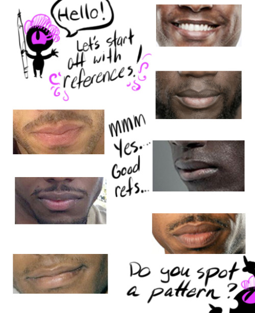
If you’re drawing a black/dark skinned person, the top lip is a slight step above or below their actual skin tone while the bottom lip can range from a faded pink to brown.

Black/African men’s and women’s lip lean towards “nude/palm of the hand” makeup color. Some cases it’s pink but everyone’s lip color varies from pink to brown. In my experience of going outside my house, the darker the person, the pinker the bottom lip is while the lighter brown skin lips will be closer to their actual skin tone.

Another note is that the pink /brown tone on the bottom of the lip is near the slit of the mouth, not the complete lip like lipstick makeup. Try adding different tones to a lip and blending both top and bottom lips together because everyone’s different! A very good detail to remember.
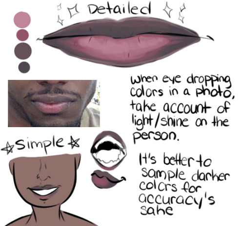
TL;DR: USE A REFERENCE. GOOGLE IMAGE SEARCH DOESN’T BITE! Thank you for your time! Go out and draw them awesome dark skinned characters and people!