An art blog I guess
64 posts
Hydrauto - Hydras Stuff - Tumblr Blog
Phil: I don't need a gift, Etoiles, your presence, your- your- your comedy, your-
Etoiles: Philllll, shut the fck up! What do you want my broooo?! What do you want, my petit frerou [little bro], tell me, I have everything you need! Do you need fruits? I have fruits! Do you need Netherite? I have Netherite! Do you need Dark Metal? I have Dark Metal! What do you want?
Phil: [Laughing] No, it's fine, I don't need anything, it's all good. You are- you are the gift. You are the gift, Etoiles.
Etoiles: Phil, Phil I have something for you. [Trying not to laugh]
Phil: Yeah?
Etoiles: [Hands him a gun]

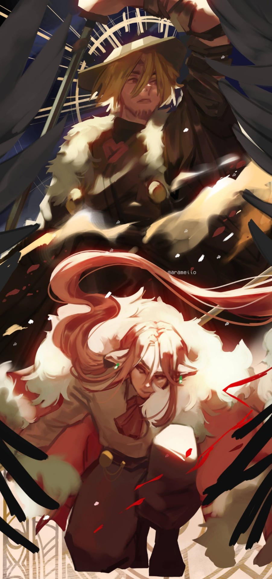
![[OC] Oh Veera Why Must You Have So Many Identities Each With Equally Complicated Outfits... (i Say As](https://64.media.tumblr.com/dc74b181f3796d54f037e4b86482316a/ab907a40c2e0b7c5-4c/s500x750/1dd2cb43b64d18d017c721de33b483fa5100344a.png)
![[OC] Oh Veera Why Must You Have So Many Identities Each With Equally Complicated Outfits... (i Say As](https://64.media.tumblr.com/10f1c303ed65b4708cebc5116b3a49c7/ab907a40c2e0b7c5-3d/s500x750/f5649666c4b7148d1453363c8369e2248cec42d8.png)
![[OC] Oh Veera Why Must You Have So Many Identities Each With Equally Complicated Outfits... (i Say As](https://64.media.tumblr.com/4bb1e18712d7e4c6755f65fd2bb10eaa/ab907a40c2e0b7c5-dd/s500x750/c564b403ff278cffe7350b2e865bd2ba76dd3d6e.png)
[OC] Oh veera why must you have so many identities each with equally complicated outfits... (i say as her writer)
(For additional info about her feel free to read through her art fight page and yes i am using that site as toyhouse alt

They're done: the Forbidden Halftone Brush Pack of your dreams.
Nine free halftone brushes for Clip Studio Paint. I will not be making another set of these so grab 'em now or never. Upload instructions are included in the folder! Thanks for your support! 😭
Past Freebie Brushes | Subscriber Brushes | And My Brush Tag


“Notes on skirts and pants”
Source: miyuli on twitter
*to the tune of Rocketman by Elton John* Cameraman: taking photos like no one ever coulddddddddddddddddddd
I will be honest guys, the Red portrait of king Charles is gorgeous asdfghjkl
it's a bad portrait. Like. Objectively. It does the opposite of what's intended. It looks like the painter is insulting him. If it was in a contemporary gallery with no context you would see it immediately as the ambivalent criticism of Charles's reign, how he fades into the overwhelming red background as a tiny little figure, small and insignificant, insufficient for the clothes he's wearing. It reminds my of Goya's portraits, how they were so 'realistic' that they ended up making these great figures look pathetic to the viewer. So these are our rulers?
the sheer novelty. the surprise and shock, the kinda cunt it's serving for no reason. I. I love it. It's an incredible portrait by Jonathan Yeo. By the sheer fact that Charles, the man, is impossible to portray as greater than man because he's just such a nothingburger of a dude. So a portrait made to make him look huge and interesting made him be swallowed in red brushstrokes. The butterfly, that reminded me immediately of " we will all laugh at guilded butterflies", draws more attention than him. It looks like an omen. It looks like a warning in all this red. Something is not right here.
This is the best royal portrait ever 10/10


Here is a round-up of all eight of the free digital brush packs that I’ve released so far for Photoshop CC, Clip Studio Paint, and Procreate!
You can download them on this page (click) Type in “0″ for a free download or tip any amount you so desire!
All my brush packs are totally free (tips optional but always very appreciated!) and can be used freely in any work, including commercial work that you profit off of, with no license or credit required. My goal with these brush packs is to make digital painting feel more achievable and accessible - especially painting environments, something I now LOVE but that used to intimidate me, & felt much more approachable with the right tools! Many of the packs also come with tutorial video content. I hope you enjoy!
take it.
i watched one (1) video on how to draw hands that changed my life forever. like. i can suddenly draw hands again

these were all drawn without reference btw. i can just. Understand Hands now (for the most part, im sure theres definitely inaccuracies). im a little baffled
yknow i never noticed the sheer rareness of images having ids or alt text on this website until i started adding alt text to my art (and trying to remember to add it to any images i post in general, especially text screenshots) and that makes me kinda sad
![Title card reading: [Storyboarding Basics. Brought to you by NU Animation Club, March 23 2023]. There is a chibi drawing of Feeb drawing on a CINTIQ](https://64.media.tumblr.com/1bb4994121212e48c92ee88de5cbe45d/8f6b9c73271b12ac-28/s500x750/efeaa63ce1f755c3643a35f0973a68f1f1057236.png)


a couple snippets from a presentation i gave at school this past week on storyboarding!!
‼️DISCLAIMER: I am still a student and have only worked on student and indie projects! This is just stuff that I personally find helpful as an amateur, so feel free to take it with a grain of salt!
Happy boarding, friends! ✍️💕
![Title card reading [Storyboarding Techniques: A Sequel to "Storyboarding Basics". Brought to you by NU Animation Club, Nov 2023]. A chibi drawing of Feeb holding a stylus waves in the bottom right corner.](https://64.media.tumblr.com/e302676ef8b68efe7a62a939a15cb663/2dc9b039e896ab3c-74/s500x750/8892af0d22ebc6d436bc179b688b702996e494f0.png)
![Text reads: [Boarding Action Tip: Move characters in Z-space! Beginners have a bad habit of boarding in x and y only. Don't neglect moving in z-space! It can be dynamic and exciting!] A drawing of an axis sits above the text, showing a green arrow pointing up for Y (symbolizing moving up and down), a red arrow pointing right for X (symbolizing moving left and right), and a blue arrow pointing forward (symbolizing moving forward and back). Two examples are shown on the right, depicting Vash from Trigun Stampede drawing his gun. The first one shows him running to the left and drawing his gun, moving in X-space. It is more static and plain. The second one shows him running towards the viewer, drawing his gun when he gets close, moving in Z-space. It is more engaging.](https://64.media.tumblr.com/09bf64ccbeca3c5af22ae8e4e1a7142f/2dc9b039e896ab3c-b7/s500x750/e1bd4ca3916d393d46cddb2f27509370b001eed3.png)
![Text reads: [Boarding Action Tip: Go close, then far. Bring the camera close to the character. Pull back without cutting. Moving the camera allows the viewer to feel like they're fighting, too.] The example shows Finn from Archmage Ascending holding up their magic staff, the camera close to where their fist grips the weapon. The second shot shows that the camera has pulled back to have Finn's whole body in view as they swing their staff downwards, causing an explosion.](https://64.media.tumblr.com/7c1fae6a88b663c437bbc426945b2ffa/2dc9b039e896ab3c-e3/s500x750/567d1ed177ffdf54ef1974b762055082590978df.png)
![Text reads: [Boarding Action Tip: lead the eye. Inevitably, action scenes have many moving parts. Use the composition & camera movement to guide the viewer's eye in the direction of the main motion.] The example shows Juri and Utena from Revolutionary Girl Utena engaging in a sword fight. As they move from the left to the right of the arena, the camera tracks their movement. Another smaller set of boards beside the example shows how the camera's view moves to the right, following the duelists.](https://64.media.tumblr.com/cfa5965c7b8cdd59dbab679a2851eafa/2dc9b039e896ab3c-82/s500x750/1fa2c1a53cd52e943f1716dba83d7873e7dfd016.png)
![Text reads: [Boarding Conversations: Perspective is power. The angle/perspective of the camera implies power dynamics. Low looking up: the depicted character has power over the viewer. High looking down: the depicted character is under the viewer's power.] There are two examples, both showing Makima from Chainsaw Man having a conversation with Denji. The first shows two over-the-shoulder shots, both characters on equal level, and is marked [NEUTRAL]. The second example shows Makima from the perspective of a low-placed camera looking up, so she looms over the viewer; and Denji from the perspective of a high-placed camera looking down, so he cowers under the viewer. The example is marked with a checkmark and the note [stronger sense of power imbalance].](https://64.media.tumblr.com/24826ef8458d024adee7c41c062e77a5/2dc9b039e896ab3c-cc/s500x750/bf2a790ce3a0d707c94f0f676301f00744374374.png)
![Text reads: [Boarding Conversations: 180 Rule. The viewer must stay on the same side of the scene at all times. A way to test this is to make sure the character faces the same side of the screen (left or right) in every shot.] There are two examples, an incorrect one and a correct one, both depicting Dani and Dorian Wytte from Hooky having a conversation. The first example shows Dani on the left facing right, with Dorian on the right facing left. A small top-down diagram below shows that the camera sits on the right side of the twins. In the next shot, Dorian is now on the left facing right, and Dani on the right facing left. The diagram shows the camera has jumped to sit on the left side of the twins; this is incorrect. The correct example starts the same, showing Dani left facing right and Dorian right facing left. In the next shot, Dani is still facing right and Dorian still facing left. The diagrams show that the camera has changed its angle and position, but has remained on the right side of the twins. This is correct.](https://64.media.tumblr.com/9920d846a80cc6c366cfd3a52177342b/2dc9b039e896ab3c-e1/s500x750/76f9c1c2d5e13c9ff6711a46c1e003df59f63536.png)
some storyboarding techniques as a sequel to my storyboarding basics presentation. I focus specifically on tips for action and conversation scenes!
as always, these are general tips and tricks, but rules can always be broken. happy boarding! ✍️✨
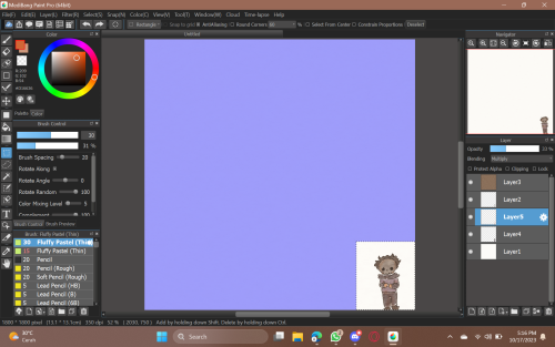
i’ve spent hours trying to decipher your emerald duo paintings and i have to ask- do you color completely in overlay or do you overlay the flats and then do a normal layer on top to add extra color bits?
hi anon, its your lucky day, bc i actually have screenshots of that painting's wip stages! i actually paint in grayscale first:

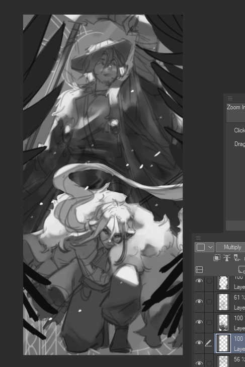
once im happy with the values i clip overlay layers to their respective characters and then airbrush colour onto wherever theyre supposed to go:
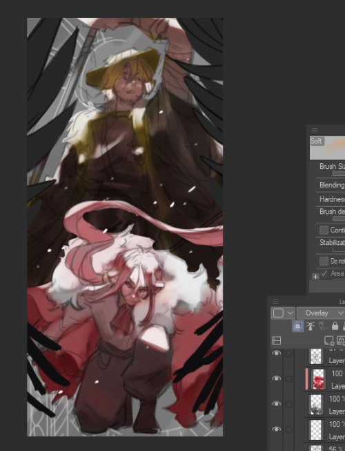
after that its just a matter of cleaning up the edges and adding details & additional shading wherever necessary!
also i usually spend a hot minute mucking around with tone curves and colour balance/hue sliders because the colours never look good from the get go
Hello! you are one of my biggest inspos and i want to try painting like you but i'm so confused as to how you add in color after painting in grayscale, and how you manage painting in such little amount of layers. I have a really hard time painting in only one layer, I use a lot for everything. Also, do you just paint over the sketch? I'm so sorry for this many questions!! thank you in advance <3
ok i will answer in point form
how do i add color after painting in greyscale
i paint greyscale first then i add colour with clipping mask overlay layer (usually). this prevents the colours from spilling over your greyscale. see screenshot:
after i've put all the colours on there i usually merge the clipping layer down into the greyscale for painting. sometimes if the colours come out gross i use hard light or pin light, or if the character is very dark-skinned i might use multiply, but usually it's overlay
2. how do i paint with like 2 layers
first off it's totally okay to paint with like 500 layers, league artists do that all the time LMAO - this unfortunately just comes with practice and figuring out what's best for you. i paint with very minimal layers bc i don't label my layers so it's a mess otherwise
3. do i paint over the sketch
i don't paint over the sketch off the bat, i usually paint underneath and then merge afterwards so that i can clean the lines and give it that painterly look
feel free to ask more if u want :D
How I Draw
I've had some (and by some I mean 2) people ask me how I draw in my storybook style so I thought I'd post about it!

First of all, I use Medibang! This is the brush that I use, you can download it from the Cloud brushes

For regular fanart, I use 1800 x 1800 canvas, although I only draw on the small parts of it. Why? idk tbh. For this style, I only draw on full canvases for my commissions

Before I start coloring, I add a new layer that will be above the other layers and add the Watercolor Page 1 Noise Filter!
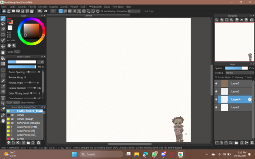
And then I color it with the same brush, I usually lower the opacity of the color layer because it's faster to achieve a more pastel look that way hehe

For shading and blushes, I use the same brush but with different size and opacity setting (as you can see I have two copies of the same brush for that very reason)
When I'm done, I just crop the entire thing!
That's it! I hope this helps!!
Ok so i've gotten a couple of people asking me how i color,, so i thought i might like, drop a mini tutorial for how i draw in general. I will explain to the best of my ability, but im not super good at this kind of thing (also this is gonna be a long post)
I will say that usually I go into a drawing with a general idea of what I want to draw, the vibe I want to give, and the colors I want to work with. Of course these can change throughout the process though.
(and side tip is to flip the canvas often, that way it's easy to catch mistakes and tweak them)
So I always start with a sketch, it's not clean or pretty, just meant to give me a good base. And from there I color in the flats

Next I take some darker colors and just throw it on top of the flats, erasing where I want there to be highlights

I then specifically take the brush called stickman (on procreate), and do a wash over the art. I find that it creates a variety of interesting colors and adds some texture.

From there, I take my usual brush (chalk) and I grab the colors created by the previous step, rendering out the form with them

Next is just the highlights, where i pretty much make a good base to start adding details and messing with layer types.
Details! I use a variety of brushes, layer types, and colors, just messing around and seeing what I like. I often stumble across something I like through this method, completely unplanned.
(also to create the wispy effect like what's around the stars, I just grab a color, use whatever layer type I think looks cool, and then go in with my eraser to add more shape to it)
The final couple of steps is still me just messing around with layer types and colors, but usual to the whole drawing instead of specific spots, possibly unifying colors and or trying to push contrasts a little further (it depends on what I'm going for). And then i finish it off with another stickman layer to add more texture back!

And erm,, Yeah! That's kinda it.. In total this took 1 h 11 min.. and honestly most of it is just me messing with things until I like it..
Hope this helps,
@ ALL RISE FANS THAT MAKE COMICS & STORIES
So I’ve noticed that in this fandom it’s common to include Deaf/ASL-using-characters into stories, which is honestly AMAZING and makes me SO HAPPY TO SEE, but many of us aren’t deaf we rely on resources, therefore:
My ASL teacher gave us this website cause it’s updates constantly (ASL evolves lots) and it’s a lot more accurate and reliable than just google :))
To work it- type the word, and a word bank will pull up, click on the term u want and a video/description of the sign and word will appear!!!
It’s rlly simple and has most words and if it doesn’t it’s bc it’s finger spelled probs!!!!
If u want more in-depth good grammar, search up “five parameters ASL”, “glossing in ASL” and watch a few videos to see “how sentence structure differs in ASL”
As always, remember it’s ok to make mistakes/notice a mistake, just be mindful and kind :D most of us aren’t out for malice and if someone is it’ll probs be very obv 😭
Happy Creating!!
You know, an interesting tumblr transformation that's happened gradually, and which I've seen no one talk about: ask-culture has essentially dropped off to nothing.
By which I mean, asks used to be WAY more of the tumblr economy. They used to be more common to send, and receive, and see. They were integral to the collaborative, forum-like behavior of old tumblr communities, not even to speak on the HUGE number of ask-blogs that used to exist to only be interacted with in ask-form.
I'm not saying this in a vying-for-attention way but instead in an observational way: I used to get way way more asks in like 2015, even with a fraction of my follower count. I wonder if it's due to the homogenization of social media sites? There's a lot more of this divide between "content creator" and "consumer" instead of just a bunch of peer blogs who would talk to each other. "Asks" aren't really a thing on twitter, are they? And as I understand it, the closest thing to an "ask" on instagram or tiktok would be a creator screenshotting some comment and responding to it in a new reel or video or whatever those content mediums are. Are asks just too tumblr-specific? Is that aspect of the site culture dying out as more and more people converge to using all their social media sites in the same way?
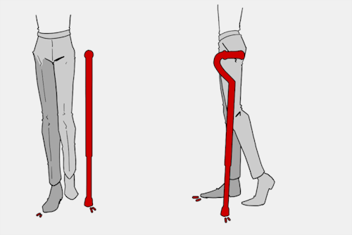
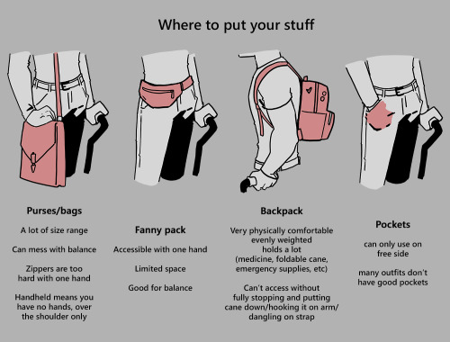
A general cane guide for writers and artists (from a cane user, writer, and artist!)
Disclaimer: Though I have been using a cane for 6 years, I am not a doctor, nor am I by any means an expert. This guide is true to my experience, but there are as many ways to use a cane as there are cane users!
This guide will not include: White canes for blindness, crutches, walkers, or wheelchairs as I have no personal experience with these.
This is meant to be a general guide to get you started and avoid some common mishaps/misconceptions, but you absolutely should continue to do your own research outside of this guide!
![[Image text] Arm bends a little. Cane height at hip joint. Many canes have adjustable height. Cane sits within the natural center of balance. Causes stress on: Triceps, upper back, wrist (pressure) fingers (grip). Helps with: Joints (lower back, hip, knee, ankle, foot), weakness, balance, pain.](https://64.media.tumblr.com/0c8731401f496885dc8d4309a7dbe7ee/f831b3159e1d7635-e7/s500x750/6e5fe00081a6ce3b64cbe1a648f0c967f9f601e9.jpg)
The biggest recurring problem I've seen is using the cane on the wrong side. The cane goes on the opposite side of the pain! If your character has even-sided pain or needs it for balance/weakness, then use the cane in the non-dominant hand to keep the dominant hand free. Some cane users also switch sides to give their arm a rest!
A cane takes about 20% of your weight off the opposite leg. It should fit within your natural gait and become something of an extension of your body. If you need more weight off than 20%, then crutches, a walker, or a wheelchair is needed.
Putting more pressure on the cane, using it on the wrong side, or having it at the wrong height will make it less effective, and can cause long term damage to your body from improper pressure and posture. (Hugh Laurie genuinely hurt his body from years of using a cane wrong on House!)
(an animated GIF of a cane matching the natural walking gait. It turns red when pressure is placed on it.)
When going up and down stairs, there is an ideal standard: You want to use the handrail and the cane at the same time, or prioritize the handrail if it's only on one side. When going up stairs you lead with your good leg and follow with the cane and hurt leg together. When going down stairs you lead with the cane and the bad leg and follow with the good leg!
Realistically though, many people don't move out of the way for cane users to access the railing, many stairs don't have railings, and many are wet, rusty, or generally not ideal to grip.
In these cases, if you have a friend nearby, holding on to them is a good idea. Or, take it one step at a time carefully if you're alone.
Now we come to a very common mistake I see... Using fashion canes for medical use!
![[Image text] 4 Major Handle Shapes (significant variation and uses). Tourist/Crook/Hook. Classic shape, fashion and medical, easy to hook on things (arm, door, chair, etc), generally solid wood (stronger, heavier). Offset. Newer design, not a fashion handle, only handle for quad-bases, generally better balance, usually aluminum (light + cheap), soft handle, adjustable (rattles/clicks when swinging). Derby/Fritz/Anatomical/Contour. Classic medical shape, many fashion variants, some fashion + medical, varies in many ways, sometimes contoured to hand, comes in foldable styles, many aluminum styles, many customizable styles. Knob/Decorative. Fashion exclusive, knob shape hurts the hand after prolonged pressure (especially with designs), tend to be heavy, "sword canes" have the same issues.](https://64.media.tumblr.com/102d2e5f13a88817eaa44974bc5a7486/f831b3159e1d7635-e2/s500x750/887023dbcfc758db12a7fcf3f258bca52eba2d53.jpg)
(These are 4 broad shapes, but there is INCREDIBLE variation in cane handles. Research heavily what will be best for your character's specific needs!)
The handle is the contact point for all the weight you're putting on your cane, and that pressure is being put onto your hand, wrist, and shoulder. So the shape is very important for long term use!
Knob handles (and very decorative handles) are not used for medical use for this reason. It adds extra stress to the body and can damage your hand to put constant pressure onto these painful shapes.
The weight of a cane is also incredibly important, as a heavier cane will cause wear on your body much faster. When you're using it all day, it gets heavy fast! If your character struggles with weakness, then they won't want a heavy cane if they can help it!
This is also part of why sword canes aren't usually very viable for medical use (along with them usually being knob handles) is that swords are extra weight!
However, a small knife or perhaps a retractable blade hidden within the base might be viable even for weak characters.
![[Image text] 4 Major base shapes (significant variation and uses). Adjustable base. Aluminum, standard modern medical, adjustable height, rubber base, wears down over time. Tripod/ quad base. If you need extra balance. Terrain attachment (varies, this is for ice). Removable, helps stop slipping on ice/snow/sand/etc, some canes have a retractable tip for ice. Classic base. Non-adjustable, custom only, modern standard still has a rubber base.](https://64.media.tumblr.com/78d350cfac4077376b7ce521a9a7d929/f831b3159e1d7635-ab/s500x750/4b4a6b8062c06686baf17c83c28b793bfb89e05b.jpg)
Bases have a lot of variability as well, and the modern standard is generally adjustable bases. Adjustable canes are very handy if your character regularly changes shoe height, for instance (gotta keep the height at your hip!)
Canes help on most terrain with their standard base and structure. But for some terrain, you might want a different base, or to forego the cane entirely! This article covers it pretty well.
Many cane users decorate their canes! Stickers are incredibly common, and painting canes is relatively common as well! You'll also see people replacing the standard wrist strap with a personalized one, or even adding a small charm to the ring the strap connects to. (nothing too large, or it gets annoying as the cane is swinging around everywhere)
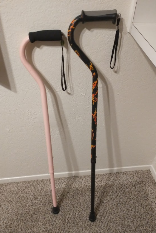
(my canes, for reference)
If your character uses a cane full time, then they might also have multiple canes that look different aesthetically to match their outfits!
When it comes to practical things outside of the cane, you reasonably only have one hand available while it's being used. Many people will hook their cane onto their arm or let it dangle on the strap (if they have one) while using their cane arm, but it's often significantly less convenient than 2 hands. But, if you need 2 hands, then it's either setting the cane down or letting it hang!
For this reason, optimizing one handed use is ideal! Keeping bags/items on the side of your free hand helps keep your items accessible.
When sitting, the cane either leans against a wall or table, goes under the chair, or hooks onto the back of the chair. (It often falls when hanging off of a chair, in my experience)
When getting up, the user will either use their cane to help them balance/support as they stand, or get up and then grab their cane. This depends on what it's being used for (balance vs pain when walking, for instance!)
That's everything I can think of for now. Thank you for reading my long-but-absolutely-not-comprehensive list of things to keep in mind when writing or drawing a cane user!
Happy disability pride month! Go forth and make more characters use canes!!!
Hi! In your pose studies do you start with the curved lines to visualize volume and then add the outline of the body part or do you do the opposite? They're very beautiful!
im not very good at explaining ahjfgdk but i usually already have the gesture in mine so ill draw the outline and then fill out the details
i've seen some people talk about whitewashing regarding the hispanic and brazillian members of the qsmp so i took some quick notes of the ccs i see whitewashed the most
Heres a google drive folder filled with art book pdfs, if anyone has some others that you’d like me to add to it thats missing, please let me know and send me the link

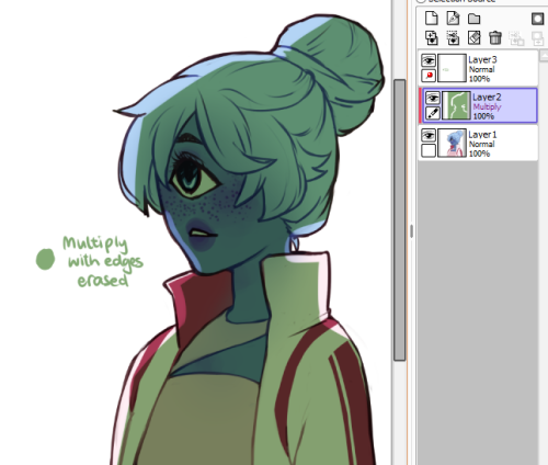
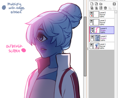
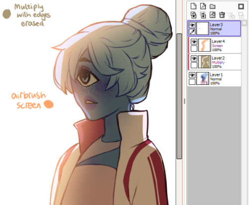
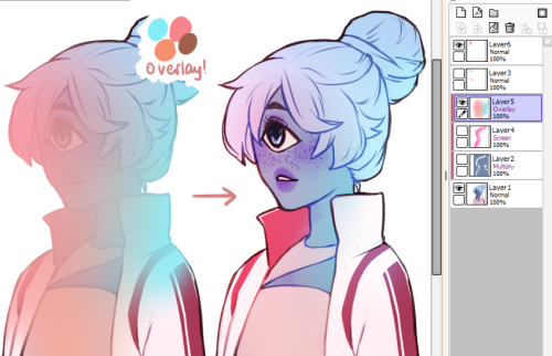
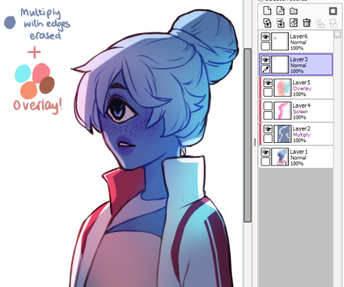
uuu thank u anon!! i hope this can explain it :^o
i use overlay all the time to make colours more vibrant and to make areas warmer or cooler. good for colourful ambient light (like glowy magic stuff).
multiply is really good for establishing a light source very quickly!! play around with the hue to get shadows with cool colours. for more detailed work you can use two or three tones on a multiply layer for more dimension.
screen is something i only recently started using regularly! it’s really great if you have a very bright light source. you can also use screen and paint on the edges of a backlit character to make the lighting more intense. a good thing to know about screen layers is that the darker the colour you use, the less it lightens; using black on a screen layer leaves no effect on the colours underneath (the opposite is true for multiply layers!).
and you can also use these layers for an entire painting instead of just on a character! i don’t have a visual example on hand, but stuff like making the area around a warm light source warmer, making a light source brighter and more vibrant, or using gradients set on multiply or screen are just some of the ways you can apply these to a full painting :)