
since the devs have canceled PVE, overwatch is probably dead, so it's now or never to make a blog about overwatch headcannons, opinions, and some occasional ships or short stories. also feel free to ask me stuff
14 posts
My Thoughts On Overwatch Designs (Reinhardt Edition)
My thoughts on Overwatch Designs (Reinhardt Edition)
Tbh, anytime I think of him, I remember when the game first dropped and everyone was guessing what he looked like without the armor, with my favorite being:

I feel that his canonical height of 7ft tall is very unrealistic (the fan-theory is that it's in the future, and humans have become taller over time, but I feel like it takes more then 50 years for a species to gain a foot of height AND most other characters are reasonable heights), and it's funny tonimagine this HUGE personality and booming voice coming from a scrawny or small dude. I could get behind the decision to have him so tall, but then they kept releasing characters as tall as him, which really steals his thunder, imo. OK, back to the main topic.
There aren't a lot of huge differences, so the devil really is in the details on this one.

The red highlights in OW1 are used much more sparingly then the yellow in OW2, which might sound like bad thing, but they are used to make the glowing heat shining through the plates of his crusader armor and the eye-slits of his helmet seem more bright/hot. This detail gets lost in the yellow of the OW2 design.
It was clever of OW2 to change the number on his shoulder from 08 to 09. It's a nice hint of storytelling in the design. Is this a new and improved suit, did he rank up, what does it mean?
I REALLY wish they kept the helmet on. It's like an episode of Scooby-Doo, where they unmask the culprit and it's just some guy. And if the base skins represent how they look in canon, why would he not wear his helmet in battle?
I'm an absolute simp for men with wild hair and long beards, and I cannot bring myself to decide which hair/beard style I love more for him.
OW1 had a circle on Reinhardt's chest, which I never was too fond of. I imagine it's supposed to be a power source of some kind, but it just doesn't come across that way. OW2 replaced it with a lion's face, and you'd think I'd be a fan, but I find it redundant to have a lion on the shield and the chest. If they had made out like the lion IS the new power source and had energy pulsing from it's mouth and eyes, that would have been cool.
Finally, the look of the armor itself. OW2 has way too many creases, open joints, and those weird straps on the front. OW1, by comparison, looks solid and defensive, with stains and scratches everywhere, and a sense of the power building up under all the protection.
OW1: 8/10 a good example of how to make boring grays and blacks seem bright and colorful
OW2: 6/10, it's got too much going on, and the exposed head feels like it stands out from the formidable mass of metal and muscle.
-
 r080t-3nthus14st liked this · 10 months ago
 -
 glitchcipher liked this · 1 year ago
 -
 gdfd35 liked this · 1 year ago
 -
 limbsandheads liked this · 1 year ago
 -
 the-reall liked this · 1 year ago
 -
 wildissylupus liked this · 1 year ago
More Posts from Shewhopats
Omnics and Gender
I've always imagined that after "The Awakening," lots of bigots insisted on calling omnics "it." I mean, of course they aren't biologically any gender.
So here are some headcannons on how I think some of my favorite omnics came to realize what they identify as.
Zenyatta and Ramattra: I think it's called "gender apathetic"? They don't care what pronouns someone uses for them. He, she, they. As long as it's not used as an insult or in a negative way. Humans tend to assume he/him pronouns for both of them, and they just kinda except that.
B.O.B: my hc is that he was some sort or construction or heavy labor worker. Hence why he's so freaking huge. After gaining sentience, he got a job as a butler. Maybe used his paychecks to get that mustache and abs that really sells him as male. Even though he has a gentle side (often only shown to Ashe), he still loves to fight, shoot, punch, run, and all that stuff. Also, in the Reunion short, Ashe says she's gonna rebuild Bob. I think this confirms that he doesn't mind being modified in such ways.
Orisa and Bastion: I couldn't find a human equivalent for this. Basically when Bastion woke up in that forest, and Orisa was brought to life, the first pronouns they heard assigned to them is what they adopted as their gender. Of course Efi built a GIRL robot. Girls rule, boys drool, after all. And I like to think that Torbjorn's wife, Ingrid, gave Bastion the idea of being male, insisting Torbjorn stop calling him "it."
Echo: pretty simple. In the simplest if terms, She's a copy of a woman that really existed. Therefore, she must also be a woman.
Lynx Seventeen: canon gender neutral. After Awakening, they kept thinking they HAD to pick male or female. But neither felt right. So after much time being indecisive and bouncing between pronouns, they probably saw a ted talk or a seminar talking about it and discovered their prounouns.
Maximillen: chose to present as male for no other reason then he noticed that in the line of work he wanted to do (illegal shit), women weren't always respected. He didn't want to have to deal with the injustice of being an omnic AND a woman. If he ever faces justice, he 100% will be putting on a wig to try to get sent to a female prison.
Luna: always had very feminine tastes. When she first started wearing dresses and designing her "hair," the only attention she got was from bigots telling her she's not a real woman or perverts with an omnic fetish. So she took up singing to express herself. Despite what a lot of people think, an omnic can't just install a new voice and suddenly know how to sing. It took just as much time, dedication, and passion to train her voice as a human would. Now she is the main act, artists and celebrities around the world come to see her, and she is the realest woman in every room.
Thoughts on Overwatch character designs (Winston edition)
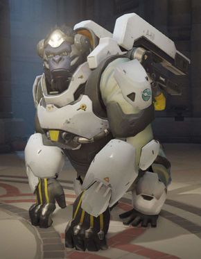
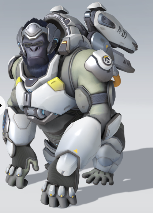
Not a whole lot of differences between skins. A very mute color pallet (gray, brown, black), with the only sharp contrast being the sharp white. It draws my eyes to his chest and forearms, but I don't know why that would add to the design. I do like the blueish-black color of his face and beard. Helps distinguish him from his suit. Both skins are clearly designed after astronaut suits but redesigned forncombat, which does come across really well. It's also a good hint towards his lore. I wish his facial expression wasn't so angry looking. I'm sure this is a reference to his ultimate, but his voicelines and interactions make him seem more gentle, curious, and awkward. I wish his expression was one of thoughtfulness or curiosity.
Overwatch 1: a perfectly fine 5/10. A good concept with a nice design idea, but without the creativity to make him anything but a gorilla in a space suit.
Overwatch 2: an above average 6/10. It has more rounded, softer edges, and his proportions looke like they have been modify in a way i like (bigger head, broader hindquaters, stomach sticks out more). And I like how the metal on his head was re-imagined to look like a headpeice.


Thoughts on Overwatch designs (Mercy Edition)
The "angel" look was a perfect design choice for her. Her skin and hair (white person with blonde hair is a very common betrayal for angels in art), her tragic backstory for motivation, her playstyle within the game. It all fits the angelic aesthetic so well.
Ow1 skin boasts a bigger halo, smaller wings, is more conserverative with the colored accents, and I like her hair better (doesn't make sense to have loose hair getting in your face when fighting). However, the oranges and yellows don't quite go with the "angel" gimmick, and i don't understand their placements. I like splashes of color, but there needs to be thought put into it. And I wish the wings were bigger and had more attention put into them. 7/10 a perfectly safe, cute, pleasant design that fits into the world she's in, and stays true to her concept.

Ow2 gives the wings more detail and orange and yellow have become golden accents, which fits her angel gimmick more. I love her skirt, with the sides that look like metal feathers, and the front and backs look like banners you would see carried by a warrior. I wish the halo was more noticeable, and she had her ponytail back. And the brown part of her torso muddles the look a bit, while black kept it together more. 7/10
Both looks have small things I like and dislike, but nothing that blows me away or draws my eye.
Juno's boring as shit. "Ouuggghh she's from space! Tee hee!" My brother in the Iris, you literally kicked off this game with a gorilla from the moon.