a portfolio of both my art and craft projects. mainly printmaking and fibers. Updates infrequently.
108 posts
This Is One Of My Prints That I Consider To Be On The Unsettling And Weird Side Of My Output.(as Opposed
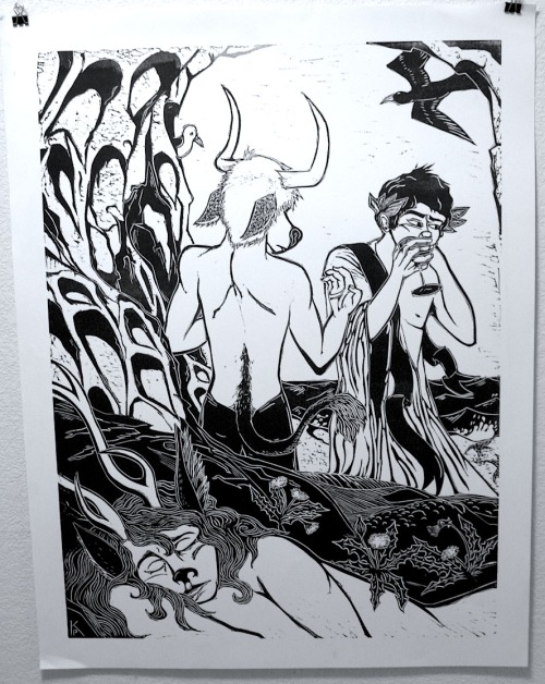
this is one of my prints that I consider to be on the unsettling and weird side of my output.(as opposed to nostalgic and cute which is my other axis) all I'm going to say about the content is she's not actually asleep (note the one perked ear) and all of my symbolism is always puns.
you'll note that I'm not giving you lot a title to gnaw on either with this one. I hate titles. it's an image. supposed to be enigmatic. and if I spoon fed you all everything with words all the time you'd think you understood what I meant to say. bask in ignorance! that's what I wish to say with this one. antler-chronology applies of course if you wish to puzzle out where it goes.
anyways, I make art out of things I wish to obsess over. I need to grind out my feelings and slash my fingers with my #4 and get embarrassed over everything every once in a while to feel like I'm making authentic art. basically, I need to throw my heart onto the wall. sometimes I need to feel judged both for my art and for my life. I need to confess and to over-share.
the part of me that produces the deer girl images, rather than my old anthro drawings I used to do is about exploring that deer-girl side vs the old were-kate side. my usual way to react to feeling unsafe and unsure is to snarl and lash out be fierce and shouty and I'm learning how to do the other things. to ask for help, be vulnerable, and be open.
I like making art that makes me personally get emotional about it. something that can remind me of how I was feeling. to hammer an emotion or a moment into a block, that is an intensely meaningful thing to me. even if, and ideally if, it conveys nothing to a viewer.
this has always been the case.
-
 jeffknopf liked this · 12 years ago
 -
 zombbait liked this · 12 years ago
 -
 nooneiscoolanymore-blog reblogged this · 12 years ago
 -
 lilylava reblogged this · 12 years ago
 -
 folk-punk reblogged this · 12 years ago
More Posts from Pencilears
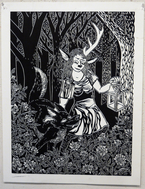
alright, this one has a descriptive title so I'll just lead with it here "As They Walked The Lantern Lit The Roses" which has the double meaning of implying that carrying light next to these roses causes them to glow, which explains why they stand out so nicely. also, I don't usually intend to imply that her antlers glow, but a lot of the time I need them to stand out from whatever is going on in the background, such is the case here.
so this was the one where I was like, oh right, the wolves aren't evil, they're just wolves, they have a different viewpoint and it's a wolf one.
this one was also made to address the technical problems of This One, as you can see I upped the detail everywhere and took time to light the trees with texture, futz around with all the dang roses, and put stars in the sky. some of my strengths are in my use of obsessive texture and this is a good example of allowing myself to indulge that urge.
what else can I say about this piece? oh yeah, the wolves are usually not male. (not that it matters, but this has been an issue when people want to see psycho-sexual themes in my work, which I do address, but not all the dang time in every one) it's a bit of a play on the idea of "Bad Bitches" or "Mad Bitches" or "Bitches Be Cray-Cray" whenever I am using them. and this one in some ways is about being at home with my sister, who supports my creative work, but she is very critical of all of my deer-girl series.
the gesture of placing a hand on the shoulder of a large dog is a very natural one to me in my life and the fingers that dig into the fur is one of my favorite details. they are on an adventure together and that contact plus the eyecontact is a show of trust.


"It Was News, And Like All News Worth Spreading, It Was Bad News"
Copperplate Intaglio Print done in hardground and aquatint. edition of 12.
I enjoy the process of intaglio. it is one of the more process heavy and yet also one of the most forgiving forms of printmaking. if I make a mistake carving a block of wood or linoleum, it is unfixable, if I mess up a lithograph in any of the million ways known and as yet undreamed of in the mind of man that there are to mess up a lithograph, there may be no saving anything. but if you mess up a plate of copper you can always go back. even if that means you have to hand-stipple it in hardground, or burnish it until your fingerprints wear off, there is a way.
there are some choices that are less frustrating than others, however.
the big thing that I have learned is you should ideally aquatint your plate once if you want deep dark blacks. even if you don't want them everywhere, you can always either block out and stage your etches or burnish them back, both of which I did here. what you can't do is get deep dark even blacks without giving your plate time enough in the etching bath to get the deep grooves you need.
etching for 30 minutes and then taking the aquatint off, (to proof it or whatever) and then reapplying your aquatint and etching for another 30 minutes will not give you the same etch as just going for 60 the first time around. (alright, I just realized that this is confusing, so I made a little diagram in mac-paint to demonstrate my point)
this isn't something Ben went over in class, I figure much of the time he just expected us to intuitively understand what we need to do to get the results we want, once we understand what the process we are expected to do is, and how to do it. this is not always the case. I feel that a lot of rookie mistakes in printmaking come from fussing over your plate instead of trusting in the process and being patient.
so, there's my secret on getting nice deep even tones out of aquatint.
to get bright whites right next to them, I used a piece of newsprint and rubbed them out after using the tarlitan to ink it, and then went back in with the tarlitan to even it out if I hit a dark bit on accident. it takes patience and a warm-but-not-hot plate.
I took intaglio twice in my time at WWU, I would like to do more of it, as I feel that I'm just getting good at it, but alas, it is hella expensive in all possible ways.
even though I tried to make pieces that worked with my other BFA material they turned out too small and too subtle to show well next to my large block prints and Chris's paintings. here on the internet however they can get equal billing, and that makes me happy.

Crow, 9" by 24 linoleum block print.
This is the the last of the long animal prints I made and while I deeply enjoy the format because it looks so banner-ey and nice the problem is, that because this is a deeply non-standard size it would be prohibitively expense to frame it. such is life.
I re-made this print again after the first run and cut out the veins on the grape leaves to add more variance in line width and texture. I dunno if this helped or hindered the image particularly as the delicate textures being the main point of interest got a little overwhelmed, but not too excessively.
hard to tell sometimes.
I do feel that I should have put more details into the bird. maybe in future I can do something interesting with that.
this is also the most obvious of my Hogwarts related symbols. another thing that amuses me greatly

Rabbit, Colored version, currently cherished in private collection.
(that's right I sell things)

"It Was Sad, And That's All There Was To It."
linoprint, 18" by 24" Black on Reeves BFK white. (so's most of what I do honestly)
the thing about this print is that I had it planned out before my dog died last Christmas eve. I was going home for the holiday vacation and I had almost everything sketched out. but I admit the raw personal tragedy is ultimately what makes this piece work.
originally I was going to have the "action" of the murder scene be front and center but I couldn't work on it without getting too worked up and in disassociating myself I pulled back the viewer too. I think it works much better and allows for the piece to be somber and calm. unfortunately this is another example of a picture where the important bits are often missed, forgive me for not wanting to go into too much gory detail.
things I like about this one: the nuthatch is rather good, as are the wolves, there are cast shadows and cast light from the lantern which is hung on the tree, the moon looks delightfully gibbous, and the roses as underbrush give the right feeling of a sacred and special part of the forest that has been invaded. I like this one quite a lot in point of fact.