The place where I reblog helpful resources for my art blog, @molagboop
905 posts
Hi!! I Ws Wondering If U Had Any Advice On Picking Good Colors In Art ?? The Colors U Use Always Seem
hi!! i ws wondering if u had any advice on picking good colors in art ?? the colors u use always seem to go together really nicely hehe ,,
there’s a lot of really good color theory materials out there that would explain how it all works far far better than i ever could
but i will show you a couple of good tricks i learned along the way that will save you a lot of time and trouble if you don’t like watching/reading loads of theory (which you should still watch/read btw, i’m not saying to ditch it altogether) and more of a practical learner as i am
i often start coloring with simply using an eyedrop tool to choose base colors, it helps to keep the same color relations as the original, that way you won’t end up with white-washed characters or wrong tones of clothing
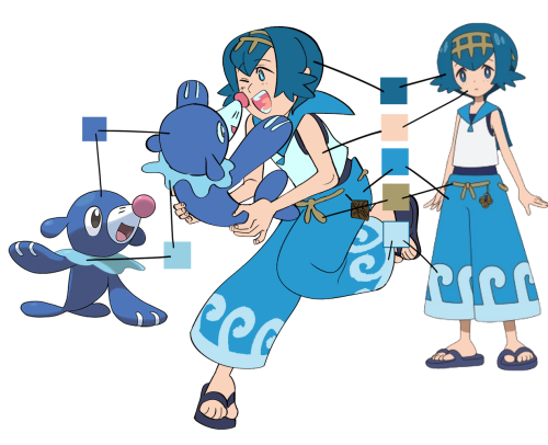
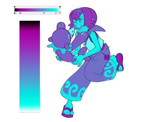
in case of this drawing the final piece has water right under the characters, so i chose to make palette warmer on the top and colder on the bottom
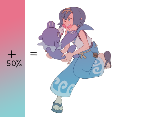
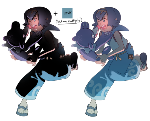
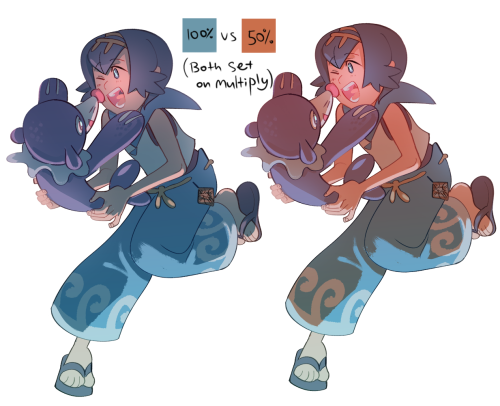
the easiest way to make a soft, less contrast palette with the same color relations is to add a solid color or a gradient under the lineart; no overlay style, just a semi-transparent layer with color; on the contrary if you want a more contrast image you’d set overlay on multiply etc
colored lineart is optional, really. a lot of times you’ll hear DON’T COLOR/LINE WITH BLACK!!!!!!! that’s fake news, black lineart can make an image pop very well, but it doesn’t work with everything, so choose wisely
there’s two ways to add shadows to your drawing - by adding shadows (duh) or by adding the absense of shadows
i use both ways but since i almost never see anyone mentioning the second one: what i mean by it is you need to fully cover your characters in solid shadow and then erase the parts with light
a lot of artists choose the color of shadow individually for every part of the drawing - skin, hair, clothes etc; i personally like to choose one color for shadow and
one whole shadow layer not only saves you a ton of time, unlike choosing color individually, but it also means you can freely play with the color of it, which can affect your image A LOT
now back to the main palette! this trick is for photoshop only as far as i know
PS has 2 really helpful overlay styles - Hue and Color and as the names suggest it changes the hue or color of your image based on the color above it
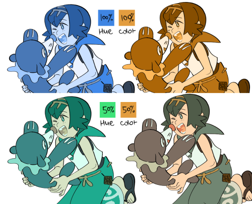
PS also has a fun thing called Gradient Map (Image -> Adjustments -> Gradient Map) that converts the monochrome tones into ANY colors of the same relation
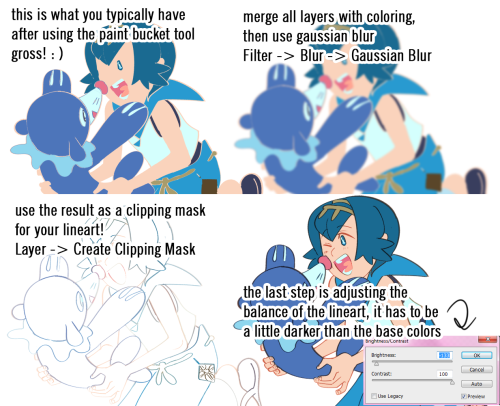
the last trick i’ll show you is particularly useful when you’re too lazy to color the lineart
i fill base colors by using paint bucket tool, it’s simple and fast, but it also means no colors under the lines
which is annoying but what can you do right? ¯\_(ツ)_/¯ actually there is something you can do! here’s a step-by-step
that’s all that comes to mind for now, hope it was helpful in any way! most of these tricks were born out of the notion “how do i produce a really good image with as much saved time and actions as possible”, which probably won’t do for perfectionists, but to all the lazy artists out there like me - try it lmao
-
 planeoftheeclectic liked this · 11 months ago
 -
 chaotic-theatrical-weaver liked this · 11 months ago
 -
 chicoryblast reblogged this · 11 months ago
 -
 rabidbandit liked this · 11 months ago
 -
 snickerdoodle-sassafrass reblogged this · 11 months ago
 -
 savethefirecat liked this · 11 months ago
 -
 jaywings liked this · 11 months ago
 -
 akiragatr reblogged this · 11 months ago
 -
 bechnokid liked this · 1 year ago
 -
 nikossavedstuffs reblogged this · 1 year ago
 -
 catboybananabread liked this · 1 year ago
 -
 voice1101 liked this · 1 year ago
 -
 variablecemetery liked this · 1 year ago
 -
 seaweedhorse liked this · 1 year ago
 -
 marskiiii liked this · 1 year ago
 -
 crowdoesart21 reblogged this · 1 year ago
 -
 martialwriter liked this · 1 year ago
 -
 hydrangeahelper reblogged this · 1 year ago
 -
 payaso-pastel liked this · 1 year ago
 -
 victoriacadisch liked this · 1 year ago
 -
 art-refs-galore reblogged this · 1 year ago
 -
 yeloo777 liked this · 1 year ago
 -
 phenom-lemon liked this · 1 year ago
 -
 writingalterras liked this · 1 year ago
 -
 novena-proxy liked this · 2 years ago
 -
 quartersqueen liked this · 2 years ago
 -
 sprinkle-bun liked this · 2 years ago
 -
 tooboi reblogged this · 2 years ago
 -
 offshorebread liked this · 2 years ago
 -
 rai-draws-stuff reblogged this · 2 years ago
 -
rai-draws-stuff liked this · 2 years ago
-
 rissychanz reblogged this · 2 years ago
 -
 erio-inspiration-reblogs reblogged this · 2 years ago
 -
 sappho-dayz liked this · 2 years ago
More Posts from Molagblep
Good anatomical comments: wrists should be near crotch, torso is roughly two ribcages tall, hands are about the size of your face
Bad anatomical comments: “girls have smaller, thinner shoulders while males have broad ones”, “women have soft faces while mean have harsher features”, “women should have wider hips”

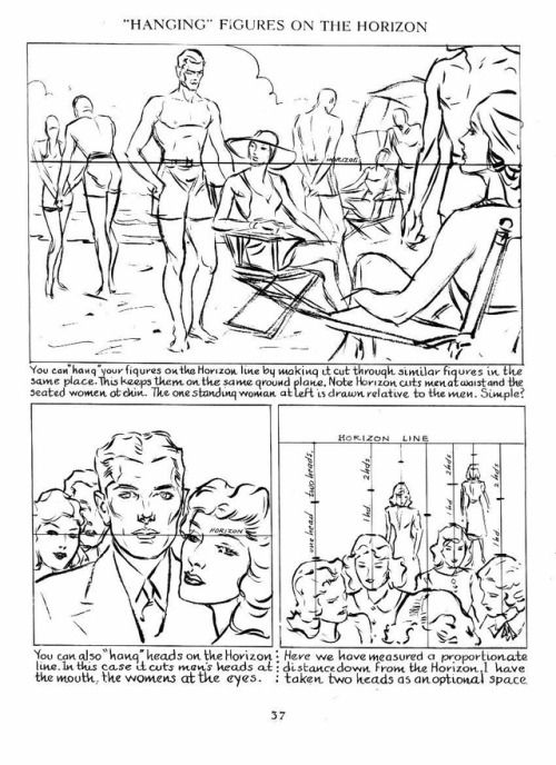
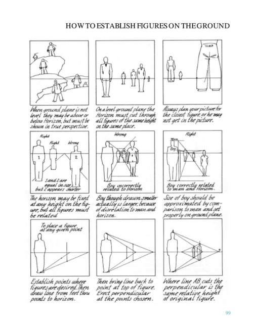
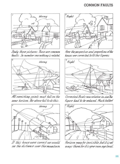
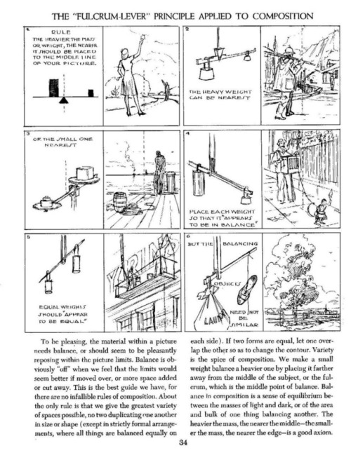
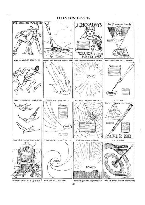
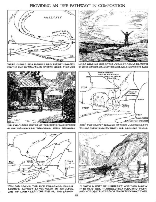
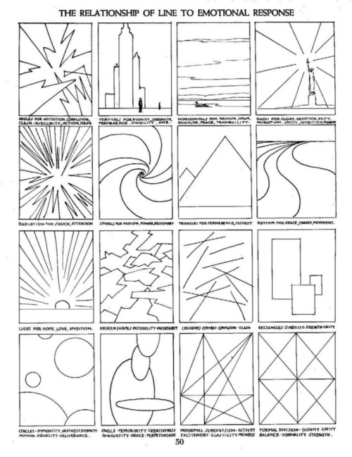
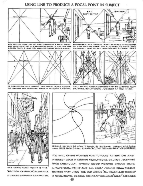
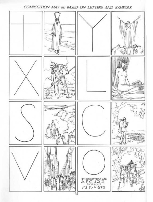

Some sample pages from Andrew Loomis’s series on how to draw comics, 1939-1961, concerning perspective and composition. (The changes in font and layout stem from the fact the pages come from different prints.)
I tried to collect the most useful pages, but of course I’m limited to only 10 images per post.
This is a follow-up of sorts of the Disney “how to draw comics” handouts I posted earlier, and which can be found HERE.
PSA for artists: learn 3D! There is a strong need for concept artists who can also translate their own unique 2D art style into 3D ! Especially in games/ interactive media!
People will seek you out before they hire two people who can only do one skill. 3d isn’t intimidating once you get the hang of it! Just another tool and one that could give you very strong advantage job-wise.
I am self taught and use Maya. I started it in college w/ a free student version.
resources:
Keep reading
