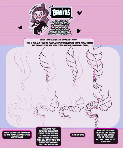
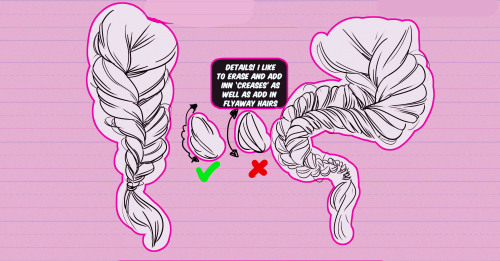
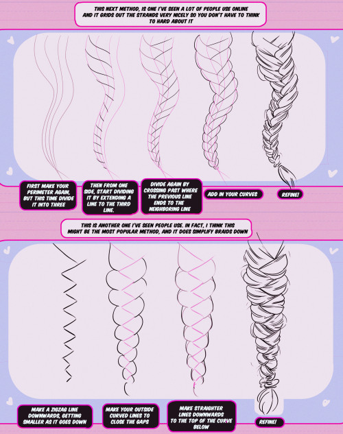
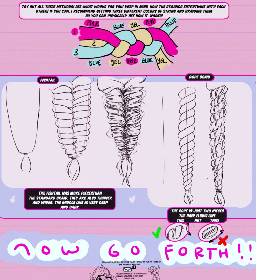
The place where I reblog helpful resources for my art blog, @molagboop
905 posts
The Big Texturing Tutorial
The big texturing tutorial
1. Definition
Texturing is a technique that involves adding local shading and details on surfaces to better represent the material of an object. This technique is of course closely linked to shading in general. This is usually applied after defining a global shading.

From left to right :
Lineart
Global shading
Completed sprite
One of the big differences between global and local shading is homogeneity. The very principle of global shading is to give a sufficiently contrasting effect between the shaded and lit areas to bring out volume and depth. Conversely, a texture must be as homogeneous as possible. It must be able to be applied on large, uniform surfaces, without making it look bad.
2. Applying a texture
A texture being homogeneous in terms of its luminosity/contrast, if it is applied to an object without taking into account the global shading, we will lose any effect of volume and depth.

A texture applied to a sphere without shading. Only the deformation of the texture can give us a clue on the shape of the object, but it is still difficult to discern. Homogeneous contrast When applying a texture to an object, shadows must also be taken into account. It is therefore important to maintain a uniform contrast between colours. A dark line separating a light zone from a dark zone should not keep the same colour between these two zones.

The color of the line will be lighter on the lighter side and darker on the darker side to preserve its contrast with the background. In the same way it is possible to apply a texture or pattern on a shaded object, by proceeding to a simple color shifting in our palette.

Combination of a texture (left) and an object that is not textured but shaded (middle).
3. Local shading
Since shading is used to highlight the bumps, there are generally two possible cases:
A groove
A bump
Each of these cases can be more or less accentuated by playing on the colors, the intensity of shadows and lights.

On the upper line, troughs ranging from the weakest to the strongest bumps. On the second line, these are bumps that stand out. The mastery of these light bumps is very important, it is the basis of the textures, and will make it possible to manage all the simple cases, such as wood or matte plastic. Example of application on a simple object:

4. Reflections
The application of a reflection is done in a simple way, by applying diagonal strips of light of varying thicknesses, and following a few rules.

A trough or bump will create an offset at the reflection level (proportional to the height change). As for the shadows, there is no absolute, depending on the palette or the material represented, it is possible to lighten or not the area at the reflection level. It is also important not to have parallel light bands on faces that are not oriented in the same direction, as on this cube:

Concrete example of the application of a gold texture on our drawers:

Or, added reflections on our previous crate:

5. Dithering and granularity
Dithering consists in creating a new false color from a checkerboard or other regular pattern of two colors close enough to give an illusion of mixing. The closer the colours are, the stronger the illusion will be. The more the colours are contrasted, the stronger the granularity effect will be.

Dithering is basically used to obtain fake intermediate shades on limited palettes, but it is also very useful for making complex and rough textures.

Example of complex dithering separating 3 colors over a wide area.

The nature of the pattern totally changes the roughness aspect. Example of the application of a sandy rock on our drawers:

Or add grain to our crate:

6. The art of destruction
The more complex a texture is, the more it will combine fundamental techniques such as bumpiness, reflections or granularity. However, some materials need to go further, by cutting, slash or breaking the base support.
Cuts It works much like bump, but on a much finer surface. We are subject to the same rules, of which here is a summary image:

From the finest to the most pronounced, on the first line of the cuts, and on the second of the bumps. A concrete example on our crate:

Exercises
Since nothing beats practice to learn, here is a series of examples from the simplest to the most complicated.
For each exercise resolved, post your results.
Mastering tools
Add a strong bump on the text of this image, except the ‘x’ which must be a groove (the center must be dug more strongly than the rest of the ‘x’):

Palette:

Add reflections on the image obtained between the two red lines shown below:

Now cut and break the letter ‘e’ as well as possible.
Add grain to the letter ‘l’.
Finalize a sprite
Texturize/colorize this sprite:

Palette:
Add reflections on the inside of the doors to give the impression that there are windows.
Add damage (cuts etc) on the right side of the wardrobe.
Make a variant of this cabinet by redoing it in gold using the palette of the gold drawers example in the tutorial. Palette:

Do the same with the sandy rock. Palette:

Sample solutions
Here are some solutions by a talented friend :

Gif process
The end.
-
 steviesketch liked this · 9 months ago
 -
 shalvis liked this · 9 months ago
 -
 bubimk liked this · 10 months ago
 -
 dreamcatchintilldawn liked this · 10 months ago
 -
 canihasblood reblogged this · 10 months ago
 -
 hokopuffs reblogged this · 10 months ago
 -
hokopuffs liked this · 10 months ago
-
 drunkmice liked this · 10 months ago
 -
 happy6machine liked this · 11 months ago
 -
 sweetmaplesyrup25 liked this · 11 months ago
 -
 shiny-shell liked this · 11 months ago
 -
 twosmallbirds liked this · 11 months ago
 -
 d3adhanded reblogged this · 11 months ago
 -
d3adhanded liked this · 11 months ago
-
 ceveks liked this · 11 months ago
 -
 artking-4 reblogged this · 1 year ago
 -
 0king liked this · 1 year ago
 -
 therado liked this · 1 year ago
 -
 splamoush liked this · 1 year ago
 -
 denverlake reblogged this · 1 year ago
 -
 le-amewzing reblogged this · 1 year ago
 -
 americanphotobullterrier liked this · 1 year ago
 -
 heyhayehey liked this · 1 year ago
 -
le-amewzing liked this · 1 year ago
-
 valekderr liked this · 1 year ago
 -
 megafurryfemboyprogrammer liked this · 1 year ago
 -
 alexdicer liked this · 1 year ago
 -
 lordsillybutton liked this · 1 year ago
 -
 telarana2099 reblogged this · 1 year ago
 -
rapidriley liked this · 1 year ago
-
 refer-a-ence reblogged this · 1 year ago
 -
 zombieboy07 reblogged this · 1 year ago
 -
zombieboy07 liked this · 1 year ago
-
 thepoetjean-makes-stuff liked this · 1 year ago
 -
 the-multi-themed-scardyfluff liked this · 1 year ago
 -
 miracleplanet2569 liked this · 1 year ago
 -
 wumbusfarm liked this · 1 year ago
 -
 noxvice-sinlock reblogged this · 1 year ago
 -
 blueeco-aurath reblogged this · 1 year ago
 -
blueeco-aurath liked this · 1 year ago
-
 babebeam093 liked this · 1 year ago
 -
 axzlguy liked this · 1 year ago
 -
 dam-vs-the-world reblogged this · 1 year ago
 -
 sharkcloset liked this · 1 year ago
 -
 doctorjohnsmith liked this · 1 year ago
 -
 revnren reblogged this · 1 year ago
 -
revnren liked this · 1 year ago
-
 wolfram-petanu reblogged this · 1 year ago
More Posts from Molagblep


I don’t know if you’ve already answered this question but what color or filter do you put your line art/sketch layer on to make them blend in well with the coloring? I’ve been trying to figure it out and they walkways come out so dark and gross
so with the exception of a few failed attempts at colored lineart, my lines are always black! i am too lazy to make new lines so mostly my “lineart” is just my sketch (usually done on a pretty large canvas with a small kyle webster pencil brush at 100% opacity but low flow – between 30-60% – but i have a few recent pieces that were done with a smallish ink pen brush in sai) but cleaned up to the extreme w the eraser and set to multiply. then i lay colors underneath that layer. when im done with colors i go back to the lines and adjust them as needed – usually all this entails is duplicating and adjusting the opacity of the line layer until i feel that the lines are appropriately bold and visible enough for me. and that’s pretty much it. occasionally i will change the hue/saturation of that 2nd copy of my line layer to a dark but vibrant color just to give it a lil extra kapow but for the most part, sorry to disappoint, i dont think i do anything special. i use a lot of adjustment layers to unify the palette of the entire image once all the actual coloring is done, but i hardly ever do anything too exciting to the linework itself. sorry/hope this helps even though i absolutely know it doesn’t


A basic tutorial on how I do ghoul skin for anon!! I wanted to include how to do fat/veins and stuff underneath the skin, but this tut is already long enough so I just stayed with the basics! Sorry if this is a bit messy, but I hope it helps!