
just a blog to store cool gif tutorials and resources <3 thank you to all creators!
182 posts
Hello And Welcome! This Is My Spin On A Comprehensive Giffing Tutorial That Not Only Covers The Basic

hello and welcome! this is my spin on a comprehensive giffing tutorial that not only covers the basic mechanics of how to gif, but also goes into the tips, tricks, and general photoshop information i’ve learned since i started giffing and now wish i could beam into my past self’s brain. this tutorial will walk you through everything from start to finish, help explain what not to do and why, and hopefully give even experienced gifmakers some new information!
note: this tutorial is very long and image-heavy, and is best viewed on dash
WHAT YOU’LL FIND IN THIS GUIDE
software needed
sourcing + storing footage
giffing: methods + step by step process
actions
coloring
text: subtitles, fonts, etc.
saving: timing, settings, exporting
posting: captions, tags, scheduling
resources
Keep reading
-
 bastardcompany liked this · 9 months ago
 -
 1oveaura liked this · 9 months ago
 -
 peachysunrize liked this · 9 months ago
 -
 rowanguerrin reblogged this · 9 months ago
 -
 gifsofthethrone liked this · 9 months ago
 -
 achingly-shy reblogged this · 9 months ago
 -
achingly-shy liked this · 9 months ago
-
 lokicorey reblogged this · 9 months ago
 -
 yourenotaloneinthis reblogged this · 9 months ago
 -
 sylviedonnas liked this · 9 months ago
 -
 envoycrown liked this · 9 months ago
 -
 sanswstrk liked this · 9 months ago
 -
 timelovcd liked this · 9 months ago
 -
 freigangs liked this · 9 months ago
 -
 paarthursass liked this · 9 months ago
 -
 armand-deromanus liked this · 9 months ago
 -
 layla4567 liked this · 9 months ago
 -
 alltoowsll liked this · 9 months ago
 -
alltoowsll reblogged this · 9 months ago
-
 ask-grapesherbet liked this · 9 months ago
 -
 pursuitproject liked this · 9 months ago
 -
 gifptv reblogged this · 9 months ago
 -
 vampiremonday liked this · 9 months ago
 -
 anthonyandrews liked this · 10 months ago
 -
 leilaorgana liked this · 10 months ago
 -
 yyenky liked this · 10 months ago
 -
 jennerkcndall liked this · 10 months ago
 -
 keanuree-ves liked this · 10 months ago
 -
 tooshas liked this · 10 months ago
 -
 claudeleine liked this · 10 months ago
 -
 berthas-russells liked this · 10 months ago
 -
 jasontoddwashere liked this · 10 months ago
 -
 edmonia liked this · 10 months ago
 -
 brendanfraserss liked this · 10 months ago
 -
 colibrins reblogged this · 10 months ago
 -
 localhummingbird liked this · 10 months ago
 -
 nightshift2017 liked this · 10 months ago
 -
 wornoutlullaby liked this · 10 months ago
 -
 podracerbarrelroll liked this · 10 months ago
 -
 nofearofwaves liked this · 10 months ago
 -
 grandmasterbud liked this · 10 months ago
 -
 vorkin liked this · 10 months ago
 -
 deductions-in-time-and-space liked this · 10 months ago
 -
 stellagioia liked this · 10 months ago
More Posts from Joshiemakesgifs
I love your art so much! Do you have any of your brushes for sale, or any tutorials, especially on colour?
Hi!! Thank you so much! 💕
Honestly, my go-to brushes are all procreate brushes with slight adjustments (like stabilization, etc.) my personal preference is brushes that kind of mimic graphite pencils. The best thing you can do is find a brush that suits you & get very comfortable using it! Specific brushes won’t necessarily improve your work, it’s all about practice! (But yes, a nice brush does help!)
I do have a video on my favourite brushes:
I’ve never really made any tutorials, but I’m happy to try and relay what I know and what I’ve learned so far!
Colours are a big part of illustration! I could probably ramble on for hours, honestly—in any case, it’s always helpful to know fundamentals of colour theory. Once you learn and apply it, it becomes intuitive! I’m gonna stick to RGB colours because CMYK is it’s own thing (printing!)
There’s a handful of basic terms like hue (pure colours), shade (adding black to a colour), tint (adding white to a colour), tone (adding gray to a colour) and also opacity (transparency) that help us understand and define the complexity of colours.

My colour choices are more often than not a gut feeling—but that does come from practice! There’s loads of colour palettes available online like this one, but if you wanna come up with your own, there’s some neat ways to do that using a colour wheel! Colours can broken down into primary, secondary and tertiary colours. We can also categorize them as warm or cold. With this we can make colour schemes!

Some basic schemes!
Complimentary: two colours, opposites on the colour wheel
Analogous: three colours side-by-side
Triadic: three colours that form a triangle, evenly spaced
Monochromatic: using one colour (using different shades)
(Bonus) Monochromatic with accent colour : using one colour as a foundation and having an accent colour (similar to analogous, but one colour is used for a majority of the piece while the accent colour is used sparingly)

It’s also important to keep in mind that values (a colour’s range from dark to light) will look different on different colours. Sometimes, you’ll put two colours together and think “huh, something about this feels off” and it turns out, the colours just happen to be very close in value and melt together. Switching your piece to grayscale just to check on your values every so often can help with contrast and muddiness! A light tone on a darker tone will look brighter than it really is. Colours can also influence each other and trick your eyes.

Environment is also a big part of choosing your colours for a piece. Determining what the setting is important! A sunset will make a drawing warmer, while a scene set in the night will usually have colder tones. Using only local colours (true colours, like green grass or blue sky) vs non-local colours (atmospheric perspective, accent colors that give depth, etc) can help enhance your drawing too. Don't be afraid of artistic interpretation!

Also, there’s always the option to use gradient maps (at least on procreate & photoshop but I’m sure it’s available in csp and other programs) where you draw in grayscale & apply a gradient map. The gradient map basically applies a color to every value (e.g all the shadows become blue and the highlights become orange) it can look really nice (and help out if colours just aren’t working that day yk)

Another thing, when I’m drawing (and this is specific to me!) I tend to start with pretty desaturated colours. Once my illustration is done, I’ll duplicate & merge my layers to do colour edits. Most programs give you the option to play with curves or colour balance—menus that allow you to play around with the hue of the shadows, midtones and highlights. I tend to make my shadows more cyan-blue, my midtones a little warmer and my highlights warmer as well. Of course, this depends on the mood of the piece, whether it’s warm or cold, lighter or darker, etc!

You can always make adjustment layers on top of your work; a low opacity yellow, magenta or blue (or anything your heart desires) overlay to tie all the colours together.

I hope this helps a bit!! Happy to answer more questions to the best of my knowledge :^)


since over time a few friends and followers asked how i color, here’s the way i’0ve been using the past few years despite having sone a few little jobs as a colorist i still do not define myself as a professional so yeah just have fun


How do you colour your gifs so well??!! A gif tutorial pls🥺🥺
hey anonie! thanks for your ask and I’m so sorry it took me so long to answer ♡ firstly, thank you for your words, it really means a lot since I struggle with coloring quite a lot 🍓 And I’d like to say don’t look at this response as a coloring or giffing tutorial.. Just look at it as a way that I make my gifs the way they are (and I’m still trying to improve!) There already are a lot of amazing giffing tutorials out there, I don’t have any links atm since I did find a way for myself how to color and gif, but here’s mine I guess 😉
this is also based on a great tutorial I saw a few days ago, you can find it here for more detailed info with all the basics and everything you need to know when giffing. my old and not so detailed tutorial (? lol) can be found here ♡
Keep in mind I’m not the best at explaining as english isn’t my first language, but I’ll try my best!
1. Resources & Downloading videos
Quality, quality & quality! The better quality the video, the better outcome (for the most part, at least). Firstly it depends from where you download the video and so on. Instagram and Twitter are usually sources of lq videos and I it’s a literally the only option left if there are no videos uploaded elsewhere. To download Instagram and Twitter videos I use Savieo. For Youtube videos I use 4K Video Downloader. If you want 4k files, adjust so that it downloads not mp4 files, but .mkv files. For Vlives, I use this site since Savieo keeps crashing on me for most of the time. You can also use .tp and .ts files since they’re high quality, esp for performances, I get them on kpop24hrs.com where you have to be a member. I also find a lot of files on Twitter, here’s a really good post about resources there.
2. Cutting the video & Programs to use!
So this is kind of interesting because I know people who only use Photoshop to cut the video and color it and nothing else. I don’t know why, but it only ruins the quality for me and I have a lot of patience, so I use Avisynth. I know others use Vapoursynth and KM Player, which.. I don’t know how to use so I can’t really explain, because both of them crash for me.
Since I use avisynth, everything about it can be found here. Installing it, using it, examples, differences, really anything and everything you need to know. I use it a bit differently tho.. When I have a .ts or any kind of file (it doesn’t really matter what format the file is if you’re using my way of cutting), but I don’t resize with avisynth. To show how I do it, I’ll download this fancam in 2k (2k makes me the same result as 4k, so I usually use this instead of 4k. It can make a difference if you’re not using Topaz tho!).
When the file is downloaded and ready in your computer, open the “video” folder in avisynth and drag your file to “x264 lossless”. It looks like this:

By dragging it here, the file won’t open in a resizer in your browser as it’s supposed to. It will open in a black window where you enter the timing you wish to gif. Mine was 00:02:21. Then simply press “Enter” and then only the white window like this will pop up

Since this is the only window available, you’ll need to press on the 8th line before doing anything. The time stamp will appear there when you cut the video. I usually press there and then open the video by clicking on the triangle arrow in the bottom left corner

This will open your video for you. Then you simply follow the avisynth tutorial where it says to use “home” and “end” to cut out the part you wish to gif. Apply it, close the window and your video is cut! The next step for me would be to upload it to Photoshop (mine’s CC 2017, I don’t have any download links).
3. Cropping!
Firstly, as I’ve mentioned previously, you’ll need to upload your gif to Photoshop. This means open PS, select “File” -> ”Import” -> “Video Frames to Layers”. From there, you’ll need to go to your “temp” folder in avisynth and choose the cropped video:

From there, press nothing else and just click okay!

Depending on the file, it will either load a little slower or faster, it’s all about frames and the format. 2k and 4k loads slower than simple HD .mp4 or .ts files. But if you want quality - it’s worth the wait. Now that we have our file open and ready, I usually start off by Selecting all frames (press on the first frame, press “Shift”, select the last frame, do the same with the layers) and Converting it to timeline animation, which can be done by clicking this little button on the bottom left corner next to your frames:

Don’t press anywhere yet. I immediately after selecting everything and Converting it to timeline animation make the layers into Smart objects. While all the layers are still selected, press in PS’s menu “Filter” -> “Convert for smart filters”. You’ll get this result:

If the timeline or frames don’t appear at first, refer to this as to what should be turned on. You can find it in the PS’s menu by pressing on “Window”:

Once you have everything ready, it’s time to crop the frames! There’s not much that goes into this, but still.. it’s important to make sure the measurements of the gifs are all good and fitting so tumblr won’t make your gifs look weird or enlarge them and ruin the quality. You can find them here:

So for this gifset I’ve decided to make my gif 268px x 450px. I go with this size for all live performances (or mostly, it looks better for me eprsonally). In photoshop, the gifs can be cropped with “Rectangular marquee tool”:

Once you click on it, make sure to add the size of the gif in here (yes, look up :D)

Now that we have all the measurements, just click anywhere on the gif you have open. This size will be applied automatically and you won’t be able to change it when dragging it. So I selected it like this:

Once this is selected, you’ll need to go to PS’s menu. Select “Image” -> “Crop”. Then, select the “Image” again and select “Image Size”. From there you’ll want to resize the gif by changing width to 268px. Height will change automatically. Then press “Ok”.

We now have the cut gif without anything, it’s purely from the video! Congrats if you made it to here with my bad explanations :D
4. Coloring!
Now’s the most fun and exciting part! Even tho sometimes it becomes too much and.. yeah, I can’t color, but I’ll try my best to explain how I do it. So I basically had a base coloring which means that it’d fix all the colors a bit as well as the skintone and shadows/highlights. Now I’ve changed it up a bit and I have the “top” coloring (if you can call it). This means that I work more on my base than anything and just adjust the top layers which is weird, but it’s more fun for me to edit, because you never know how your gif will turn out. But coloring is pretty simple - it’s just playing around and wasting your time to make the gifs look good! 😌
Main adjustments/properties you need when coloring your gifs in Photoshop: CURVES, Levels, Brightness and Contrast, Photo Filter, Selective Color and Channel Mixer. I like to start of by adding the curves layer as my base. Mark the lightest and the darkest spots in one layer with these

The first one usually is for darkest spots. It’s up to you to select where the darkest part will be. The 3rd one is for highlights. I usually use the first one only unless I need a bit more of a contrast. Only a layer of Curves added this much to a gif:
From the Curves layer I usually add a bit more of Brightness and contrast (both at 20) since it looks better like this for me lol:

Now it’s literally play time. Any colors, anything you want to do with your gif!!! After this I added Channel Mixer. Play around with blues a lot, it really helps you find a contrast, you can find it here:

Just literally what looks good, idk I sometimes make the gif all blue to have those tones, and then fix it later with Selective Color. I then add Vibrance to the gif (+100 just go for it and see if it looks good!). To not make the gif look like a pink or blue mess, I always add Photo Filter on top like this! Helps balance out the coloring and just in general, helps a lot if you want to change the tones.

I then repeat a layer for curves (copy paste it and adjust the dark parts a bit if needed). Add a bit of Vibrance again and on top of everything - Levels. Yes, Levels! Makes the gif smoother and more beautiful in general (I like adding it, but as everything in coloring part so far it’s optional). With levels I go for 20-30 depending on the gif:

After that, I have a colored gif!
5. Topaz, speed & Exporting!
This gif is wihtout topaz, but once you add it, it looks waaaay better and has better quality. You can find my topaz settings here. Once you add Topaz, you’ll need to select all layers of your gif. Then select this and wait:

Topaz is slow af and loads like crap but still.. worth it since the gifs do come out with a really good quality! Once Topaz loads, if you’ve selected all the layers before pressing on “Flatten Frames Into Layers”, simply press “Delete” on your keyboard. It will eliminate the unused layers of coloring since it was applied to the gif.After that, select this:

and then this to make frames!

Then again, select all the frames with the “Shift” as I’ve said before. You’ll then need to change the speed of your gif (I always go for 0,05). Youcan change it by selecting all the frames and clicking on one of the frames here:

After you open “Other”, just type in 0,05 and press “Ok”. After that’s done, you’ll need to export it. Exporting means another bunch of settings needed to adjust. Here’s mine:

In this window, you’ll need to select “Save”, save your gif by naming it however you want and voila! The finished gif!

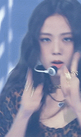
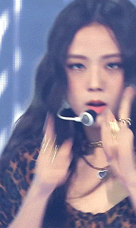
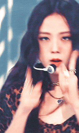
Ofc it’s not as good as it should be because ya girl rushed the coloring when it usually takes up to a few hours to color all the set but I tried my best and this is how I make my gifs. I hope this helps those who wish to make gifs and content, ccs always appreciate those who want to learn! ♡ If you have any questions, let me know by dropping a message, my inbox is always open ♡
Now this just shows how much work goes into making gifs and how much time it takes to make 1 gif. People who justify stealing of work like this are crazy, because we do put a lot of effort and time into this. I’m happier than ever to help and explain as much as I know (even though I’m not good at coloring) rather than fighting for stolen gifs and people who are ignorant about this. Thanks for the ask again, anonie, I really hope you’ll make gifs and find your style eventually when coloring them! Makes me happy when people want to learn and find themselves a little happy place when making cool stuff like gifs and edits ❤️