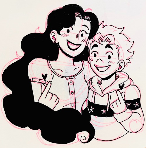
Idk If This Is Really Noteworthy Or Not, But I Was Going Through My Folders On DA And Realized That Ive

Idk if this is really noteworthy or not, but I was going through my folders on DA and realized that I’ve already drawn more now than I have in years.
-
 zebrasonice liked this · 1 year ago
 -
 authorjones liked this · 1 year ago
 -
 refrainbowno1 liked this · 1 year ago
 -
 knight5tar liked this · 1 year ago
 -
 cardioat3am liked this · 1 year ago
 -
 johnny-but-emo liked this · 1 year ago
 -
 diamondsheep liked this · 1 year ago
 -
 thatsmolnugg liked this · 1 year ago
 -
 entomologistologist liked this · 1 year ago
 -
 daisysbike liked this · 1 year ago
 -
 christ-chan-official liked this · 1 year ago
More Posts from Hc-artz
More facts about Floff (because I really need to talk about her more)
The Blooks were the first friends she made when she moved to Waterfall. She considers them to be her closest friends.
Unlike the other monsters, she likes Napstablook’s music.
She always attended the ghosts’ backyard plays/performances. They worked around her work schedule so that she would be able to.
Did her best to be there for Napstablook when “Happstablook” left.
She could use a helping hand at her shop, but she’s too stubborn to accept it.
She met Sans when she bit the bullet and tried taking applications for once. He was the only one that responded. Obviously, due to his laziness and Floff’s tendency to micromanage, his employment didn’t last long. Despite this, they’ve remained good friends.
After that, though, she didn’t look to hire anyone else.
Lets the spiders run their bake sale in her shop— not because of how intimidating Muffet is, no, not at all.
After the barrier shattered, Mettaton designated her as the costume designer for his troupe.
If you’re interested in learning more about her, you can check out her full bio here.
YOUR COLORS ARE SO VIBRANT EEEE!!! HOW DID YOU DO THAT ON PAPER?? ITS AMAZING!!!!!
TYSM!!!! 🙏💕 I’ll do my best to explain!
Okie, so this is how my drawings look before I do anything to them. Depending on the lighting of the room, the color(s) might already pop well enough.

Next, I decrease the contrast. You can go all the way back to -100, but usually I go to about -70 or less. It varies from drawing to drawing and really just depends on what looks best to you. I also like it because any pencil/eraser marks don’t stick out as badly.
After that, I adjust the brightness and black point until they look right to me.
By then, the colors will probably be vibrant enough to where increasing the saturation won’t be necessary, but I say go for it if you want. I like to go up a smidge myself.
Lastly, I slap a filter I like best over the drawing (“Vivid” for the iPhone is my go-to).

And here’s the result! I hope this was helpful. :>