
How I Pratice Drawing Things, Now In A Tutorial Form.The Shrimp Photo I Used Is HereShow Me Your Shrimps
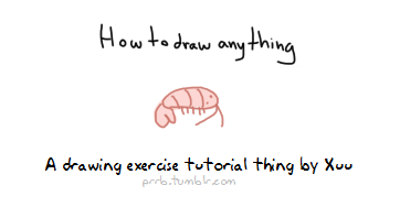

How I pratice drawing things, now in a tutorial form. The shrimp photo I used is here Show me your shrimps if you do this uvu PS: lots of engrish because foreign
-
 aries-in-wonderland reblogged this · 9 months ago
 -
 rizeru liked this · 9 months ago
 -
 swarovski-yoda liked this · 9 months ago
 -
 drowsyfudge liked this · 9 months ago
 -
 nightmareturtle liked this · 9 months ago
 -
 youhavethesun liked this · 9 months ago
 -
 dangerouspeanutfarts reblogged this · 9 months ago
 -
 blankboi25 liked this · 9 months ago
 -
 not-that-other-lys liked this · 9 months ago
 -
 clangpan reblogged this · 9 months ago
 -
 corvarrow liked this · 9 months ago
 -
 chim3ras liked this · 9 months ago
 -
 sleepy-moonie liked this · 9 months ago
 -
 knowthevoidisscreamingmad reblogged this · 9 months ago
 -
 gay-little-izzet liked this · 9 months ago
 -
 gibbycat liked this · 9 months ago
 -
 douglysium reblogged this · 9 months ago
 -
douglysium liked this · 9 months ago
-
 armands-ipad liked this · 9 months ago
 -
 galapagos-spinch liked this · 9 months ago
 -
 astrisjanus reblogged this · 9 months ago
 -
astrisjanus liked this · 9 months ago
-
 wistelligence liked this · 9 months ago
 -
 arsonist-faerie liked this · 9 months ago
 -
 stawberrycatcow reblogged this · 9 months ago
 -
stawberrycatcow liked this · 9 months ago
-
 molecularhomosexual liked this · 9 months ago
 -
 tinkerbellmudmonger reblogged this · 9 months ago
 -
tinkerbellmudmonger liked this · 9 months ago
-
 robertpattinsonstench reblogged this · 9 months ago
 -
robertpattinsonstench liked this · 9 months ago
-
 quattrojob liked this · 9 months ago
 -
 shellos33 liked this · 9 months ago
 -
 perestroika-hilton reblogged this · 9 months ago
 -
perestroika-hilton liked this · 9 months ago
-
 oneirophasia reblogged this · 9 months ago
 -
oneirophasia liked this · 9 months ago
-
 resources-up-the-wazoo reblogged this · 9 months ago
 -
 chiiroptereh liked this · 9 months ago
 -
 the-unforgotten reblogged this · 9 months ago
 -
 mycosect liked this · 9 months ago
 -
 funfuntrunks reblogged this · 9 months ago
 -
 cloffer liked this · 9 months ago
 -
 millenianthemums liked this · 9 months ago
 -
 calamondinblooms liked this · 10 months ago
 -
 hei-ranapologist reblogged this · 10 months ago
 -
 itsruntaofan reblogged this · 10 months ago
More Posts from Artisium
Quick art tip - child proportions
Ok this is a real quick one but let me show you how to get more-or-less accurate sizes for child characters. Kids are tricky to draw, they are - from toddler up to about teens people change radically almost every year so pinpointing character’s size during those years is pure hell.
What you need to do to make everything super easy for yourself is to check their Head Proportion. What makes kids look like - well, kids, is that their heads are proportionally large in comparison to their body.
Average adult is about 7,5 heads tall in comparison to their own body, however with children under 10 that number is just under 6 heads with about 1 head shorter the younger you go down to 3 heads as an infant.
Easiest way to figure the so-so head-height of a certain age is to find images of said age group and do a quick count on them

at which after you can replicate it in your own works - don’t mind if it’s not 1:1 with reference, finding images that are actually of the age you need is tricky and kids in general vary a lot so someone might be a lot taller than others. You have a bout 0,5 -1 heads of wiggle room before it starts to look way older.


Proportions are super important in art and i lovingly recommend everyone to figure out basics of them - it’s the easiest way to get notifically better with art. I could go on about proportions but let’s wrap this up. Need to note however that head proportion is not same as character height - a character can be 15 feet tall but still have head-height of 6, HH is simply a way to scale out the body.

Idle posing
Idle posing seems to be a thing most people overlook. But in truth, your character’s idle stance probably holds volumes of information about their character, most likely even more than any other stance they assume. This is because our default stance tells everyone around us about the demeanour, aura and mood we resort to when we’re not appropriating ourselves.
What’s so tricky about these kinds of poses - is how sensitive it is. And how complex the human body communicates. One nudge of the arm, the tilt of the head or curve of the spine can alter our perception of a character’s attitude completely. And sometimes, combinations of such variables can mean that some contributors are neutralized or maybe even switches its meaning entirely.
- Watch theatre. The actors are taught in communicating moods and attitudes to a tee and can give you a very clear look at how the exaggerated mannerisms we see in animated shorts, manifest in human form.
-Sit yourself down and watch old cartoon shorts. Watch how other animators and artists have gone about tackling posing like this.
-Look at yourself in the mirror, observe how subtle the changes are when you swap between poses and moods.

Some quick thumb rules that generally apply ( but can still be reversed or neutralized when used in combination with other mannerisms )
Open posture
Vulnerable parts exposed. Torso open, shoulders back and legs spread apart.
An open posture communicates confidence and courage. A person with an open posture is not afraid to take on whatever challenges come their way.
Closed posture
Vulnerable parts are hidden. Shoulders in tugged in against the torso. Legs close together
A person carrying a closed posture is not as brave and brawny as those with an open posture. They have a tendency to be nervous and can be easily intimidated by some challenges.
Dominant demeanour
Character defaults to literally looking down on others. Either by towering, if they’re taller than the character they’re looking at. Or by glaring up from under their brow if they’re shorter.
These characters hold a strongly dominant aura around them and will seek the upper hand in most situations. Dominant demeanour isn’t necessarily meant to be intimidating but more as a tool for the character to look and feel powerful and in control if coupled with an open posture.
Submissive demeanour
Character defaults to maintaining a direct line of communication between their own and their companion’s face when interacting.
These characters can be perceived as more mellow than those of dominant demeanour. They appear more open and friendly since they’re not trying to impress themselves on you with their physique. They can also come forward as naive and optimistic.
On top of these thumb rules, you got all the variables that can either add or subtract from the intensity of their respective traits.
Variables such as shyness, aggression or aloofness serve as additional hints on a character’s personality. But be careful when you browse for these additional values. Each combination of these gives a completely unique attitude.
Take a look:


Conveying character through their attire
So there are two things to conveying your character through their attire. Well, three if you account for the bit of personality that is by default embedded in their choice of fashion.
Surface values
Let me tackle the ladder first cause it is the simplest one to explain:
If you want to convey that your character likes scorpions or snakes, you slap a snake on them somewhere or otherwise drop aesthetical hints of this particular interest. These are choices made consciously by the character, and should therefore also be treated like so in-universe. This is your character going out of their way to express an interest in a certain topic.
These are the most blatant and ‘easy’ ways to implement personality to your character’s outfit.

Subcontextual values
Where it gets a little more meta is when we start to consider their function, job and social layer, their opinion on norms such as gender and sexuality, etc. Values that contributes to the character’s subconscious. As well as choices made inspired by their lifestyle.
Let’s take a look at the two drawings above ^. The character is obviously the same. But their outfits are rather different.
Both hold an inch of vanity, as it is obvious that the character pays attention to how people perceive him ( note the styled hair, perfectly fitted and spotless clothes ). However one submits itself to a lifestyle heavily influenced by formalities, and proper conduct while the other comes forward as more free-spirited and radical in their attitude. Take a second look at the two outfits. Contemplate how the cuts, rate of coverage and choice of accessories separates the two outfits from one another. And what that, in turn, tells us about the character.
What does he do for a living?
What’re his thoughts of conformity?
Is he a by-the-book person, or more of a happy-go-lucky type?
What materials and pigments are used in the outfit?
Are these expensive pigments and materials?
What does the materialistic quality and style of the outfit tell you about the character’s economic standing?
What ‘s the overall impression you get from the characters physique in combination with the attire?
There are a great many things you can derive from simply looking, and those are just a handful of analytic points you can study when looking at characters ( and humans too IRL )
Meta contextual values
We’ve taken the character’s conscious and subconscious choices into account. Now it’s time to bring our own agenda forward. What do -you- want to communicate with this character. Your OC might have their own tastes and preferences, sure, but did you know that -you- can control the way your audience perceives your character, outside the choices your character makes actively for themselves in-universe?
By fidgeting with the overall shapes present in the outfit ( and character anatomy too actually ), we can provoke psychological responses based on instinctual thought processes and presumptions hardwired into our subconscious. Here’s a quick rundown of those shapes and how they work.


These tropes can, of course, be mixed, matched and used to any degree that you want. Not every production or project makes use of these particular figures by committing themselves 100% to their attributes. But you will frequently see traces of these tropes applied in competent pieces of visual storytelling, as it has proved effective in directing our perception of a character without even having to tell us outright; what their personality is going to be like.
You can also hint at character’s development, by subtly implementing some tropes from one category into the other. Or hint at an underlying character trait that otherwise isn’t communicated by the character’s dialogue or immediate actions.
If you manage to combine both posture, the formalia of outfit design and the meta-contextual design, you’re pretty well set to tell your story to your audience.
I Hope this has been somewhat helpful. It is one of my favourite parts of character design and storytelling - so it felt great to talk about at length again.
- Mod wackart ( ko-fi ) Tristan is property of Studio!Wackart


Drawing from films
Drawing from films is a ridiculously useful exercise. It’s not enough to watch films; it’s not enough to look at someone else’s drawings from films. If you want to be in story, there’s no excuse for not doing this.
The way this works: you draw tons of tiny little panels, tiny enough that you won’t be tempted to fuss about drawing details. You put on a movie - I recommend Raiders, E.T., or Jaws… but honestly if there’s some other movie you love enough to freeze frame the shit out of, do what works for you. It’s good to do this with a movie you already know by heart.
Hit play. Every time there’s a cut, you hit pause, draw the frame, and hit play til it cuts again. If there’s a pan or camera move, draw the first and last frames.
Note on movies: Spielberg is great for this because he’s both evocative and efficient. Michael Bay is good at what he does, but part of what he does is cut so often that you will be sorry you picked his movie to draw from. Haneke is magnificent at what he does, but cuts so little that you will wind up with three drawings of a chair. Peter Jackson… he’s great, but not efficient. If you love a Spielberg movie enough to spend a month with it, do yourself a favor and use Spielberg.
What to look for:
Foreground, middle ground, background: where is the character? What is the point of the shot? What is it showing? What’s being used as a framing device? How does that help tie this shot into the geography of the scene? Is the background flat, or a location that lends itself to depth?
Composition: How is the frame divided? What takes up most of the space? How are the angles and lines in the shot leading your eye?
Reusing setups, economy: Does the film keep coming back to the same shot? The way liveaction works, that means they set up the camera and filmed one long take from that angle. Sometimes this includes a camera move, recomposing one long take into what look like separate shots. If you pay attention, you can catch them.
Camera position, angle, height: Is the camera fixed at shoulder height? Eye height? Sitting on the floor? Angled up? Down? Is it shooting straight on towards a wall, or at an angle? Does it favor the floor or the ceiling?
Lenses: wide-angle lens or long lens? Basic rule of thumb: If the character is large in frame and you can still see plenty of their surroundings, the lens is wide and the character is very close to camera. If the character’s surroundings seem to dwarf them, the lens is long (zoomed in).
Lighting: Notice it, but don’t draw it. What in the scene is lit? How is this directing your eye? How many lights? Do they make sense in the scene, or do they just FEEL right?
This seems like a lot to keep in mind, and honestly, don’t worry about any of that. Draw 100 thumbnails at a time, pat yourself on the back, and you will start to notice these things as you go.
Don’t worry about the drawings, either. You can see from my drawings that these aren’t for show. They’re notes to yourself. They’re strictly for learning.
Now get out there and do a set! Tweet me at @lawnrocket and I’ll give you extra backpats for actually following through on it. Just be aware - your friends will look at you super weird when you start going off about how that one shot in Raiders was a pickup - it HAD to be - because it doesn’t make sense except for to string these other two shots together…


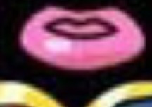

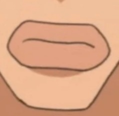


Hey jsyk it’s 2018 and if you’re still drawing characters with big lips like THIS, even if they’re pale/not black, it’s fucking racist. Stop doing it.
No excuses. “It’s a stylistic choice!” It’s a RACIST stylistic choice.
“Idk how else to draw big lips!” That’s because you relied on racist caricatures and are a bad artist. Teach yourself. Learn. If you’re not willing to do that, then you are a bad, racist artist.
“But it’s part of the character design!” Yeah, and it’s racist. If it’s your OC, then change it. If it’s not your OC, make the right choice and draw them with normal looking bigger lips instead of this racist monstrosity.
And if this post makes you uncomfortable because it’s calling you out for stuff you’ve done, good. Fix it. Own up to it. Grow.
If you see this and you’re first thought is to defend this: you are racist. You are part of the problem. Congrats. Now work on yourself and unlearn that.