
Mr. and Mrs. Little often discussed Stuart quietly between themselves when he wasn’t around, for they had never quite recovered from the shock and surprise of having a mouse in the family. He was so very tiny and presented so many problems to his parents.
85 posts
Hi Mem If I Could Pick Your Brain About Typography - How Do You Know How To Position The Words Of A Phrase
hi mem if i could pick your brain about typography - how do you know how to position the words of a phrase on a gif? i'm working on something right now where i want to place a lyric in a more varied fashion than simply straight across the gif, but i'm not sure how to arrange the words so they fit together. sorry i hope this makes sense
You may certainly pick my brain as it is one of my favourite subjects. :) This got a little long, but hopefully it’s not too rambly lol.
INTRO.
Typography placement is primarily about the composition of the gif pre-text, where the word/phrase you want to emphasize is + what it looks like, and how many words/phrases you want to emphasize. We’ll talk arranging the text in relation to itself first, and then about where to place it on the gif (heretofore referred to as the “base”).
1. CENTERED TEXT.
This is pretty much the most straightforward option: you have your highlight word, and then you can center either a)as a stack with lines above and below, b)as a sandwich w lines on the left and right, or c)as a set of two lines either above/below.

Literally the only thing that defines which method you use is a)where in the text it’s located (beginning, middle, end) and b)what vibes you’re feeling that day. My only caution here is to watch for balance: having a ton of text on one side of the main word/phrase and almost none on the other tends to look pretty wonky.
2. SPLIT TEXT.
This method is a variant on the first, except that something about the text/font means that method 1 doesn’t work well. This could be because an ascender/descender gets in the way, because I want a more square shape than rectangle shape, or just because it matches the font better.

Ex.1—“you’re facing down”—the ascender of the “d” is the problem here. If I just centered the upper text, the two words would overlap unless I moved the text waaaaaaay far away from each other (and generally, typography for a single phrase looks best grouped tightly). Breaking up the top line avoids this issue.
Ex.2—“Bending backwards”—the severe tilt of the text made centering it feel off balance (to me). By shifting the top & bottom text to either side, it “supports” the tilted text and keeps it grounded in frame.
Ex. 3 —”when all hope is lost”—has two issues. First, the extreme height of thee ascender of the “h” and the depth of the descender “p” get in the way of top/bottom text, and the circle I wanted enclosing the text prevents a long horizontal composition. Dropping the word “hope” down onto the line with the second line of text, and centering it below the first, avoids this.
Now, a breakdown using Ex. 1, with one I think doesn’t work and three I think could work.

A: As stated above, it crams too close to the ascender of the d, and has a weird boxy feel.
B: Top line is shifted over so it’s not a true center, but because the bottom line isn’t centered you can’t tell. Could work, but I think the order of how you read it gets a little lost since as the the “d” comes first, it makes it look like “down” is to be read before the top line.
C: Placing the “you’re” in front of the “d” fixes the reading problem. The centering looks just fine; perfectly acceptable.
D: This is the version I went with, mostly bc similar to ex.2, I liked the grounding on the left/right. Could easily go either way.
3. MULTI-FONT/EMPHASIS TEXT.
I don’t do this terribly often in the same gif, so two of the examples are from the same set, but I hope they’re at least different enough to give you vibes lol. Basically, the way this one works is you have two phrases/words you want to emphasize, so a blending of centering & forming goes on.

4. SO WHERE DO I PUT IT?
Once you’ve arranged your text, you still have to figure out where it goes on your base. That’s where considering the composition of the image comes in.
Having the text in the middle of your gif is far and away the easiest and most common placement, BUT if you have any gifs that’re heavily weighted to the left or right (for example if you have a gif with a person all the way on the left side and nothing on the right), it’s going to look weird if your text is centered. In these cases I switch to some kind of pattern: either the text maintains a left-right zig-zag (left on gif1, right on gif 2, left on gif 1, etc.), or I alternate between left-center-right-center-left (or left-center-right-center-right, if I want a V). Basically, alternating is key.
Another consideration is if you want to highlight anything with your text. For example, in this set I had a pretty busy centerpiece and having text on top of it would be way too much, but also I didn’t want to distract from it. I solved this problem by arranging the text on a path that matched the symbol, so it felt like part of the image, instead of something slapped on top. There’re a lot of things you can do to mesh text & image, and this is easily where you can have the most fun.
CONCLUSION.
Two really useful questions to ask yourself when working with type are 1)does this feel balanced? and 2)can you actually read it in the order it suggests? Because, ultimately, typography is a vehicle—if you can’t read/understand the words, or the text gets in the way of appreciating the image, that’s really the only way it can “fail.” Otherwise, everything else is just style and flavour. :)
-
 thestuartlittle reblogged this · 1 year ago
 -
 florence-pew liked this · 1 year ago
 -
 dreamscorched reblogged this · 1 year ago
 -
 wicked-source liked this · 1 year ago
 -
 astarfires reblogged this · 1 year ago
 -
 girlmythos-aa liked this · 1 year ago
 -
 thewanderingace reblogged this · 1 year ago
 -
 repmet liked this · 1 year ago
 -
 destiiny reblogged this · 1 year ago
 -
 bisexualalienss liked this · 1 year ago
 -
 sasuhinanaru reblogged this · 1 year ago
 -
 love-must-carry-on reblogged this · 1 year ago
 -
 leetkx liked this · 1 year ago
 -
 naturalsources reblogged this · 1 year ago
 -
 irestech reblogged this · 1 year ago
 -
 gunnersatheart liked this · 1 year ago
 -
 jhack09 reblogged this · 1 year ago
 -
jhack09 liked this · 1 year ago
-
 rhaeneystargaryen liked this · 1 year ago
 -
 lady-whistledowns liked this · 1 year ago
 -
 gmzyns reblogged this · 1 year ago
 -
gmzyns liked this · 1 year ago
-
 phyla-vells liked this · 1 year ago
 -
 mrs-steve-harrington reblogged this · 1 year ago
 -
 chiekorita liked this · 1 year ago
 -
 kieselguhrkid liked this · 1 year ago
 -
 bandomgay liked this · 1 year ago
 -
 my-own-cup-of-tea reblogged this · 1 year ago
 -
my-own-cup-of-tea liked this · 1 year ago
-
 chaoticresources reblogged this · 1 year ago
 -
 tolkiens liked this · 1 year ago
 -
 rndomsstuff liked this · 1 year ago
 -
 hollygl125-gif-love reblogged this · 2 years ago
 -
 eurydia liked this · 2 years ago
 -
 great-exhibition-of-1851 liked this · 2 years ago
 -
 stagbeetleboy liked this · 2 years ago
 -
 caelys liked this · 2 years ago
 -
 hegodamask reblogged this · 2 years ago
 -
 dreamcreations reblogged this · 2 years ago
 -
hegodamask liked this · 2 years ago
-
 chpplsroan liked this · 2 years ago
 -
 girlmythos-a liked this · 2 years ago
 -
 arkivish reblogged this · 2 years ago
More Posts from Thestuartlittle

Fic Recs/Book Recs Page 02
done for the codingcabin coding awards pagecraft challenge!
features
title and home/ask/archive links.
you can select multiple filters at once
three built in filter categories (you can add more if you’re slightly familiar with html)
4 built in characters/filters but you can add more
built in ratings filters but you can change those to other kinds of filters
favorite filter including a heart icon for fics in that category!
credits
honeybee icon font by @suiomi
tumblr controls fix by @cyantists
isotope combination filter tutorial by @magnusthemes
typical theme rules apply: like/reblog if you use, don’t steal, you can edit in any way as long as you don’t use it as a base, ect. if you have any questions, ask me and i’ll try and answer. as this is a page theme, you’ll need some knowledge of html/css to edit it but i’ve done my best to explain everything inside the code. lmk if there’s anything wrong in the code!
this was mainly built for fic recs but i’m sure you could use it for book recs too or anything else you might have in mind!
preview ✘ code ✘
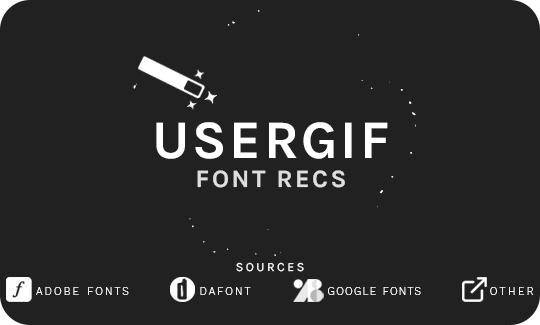
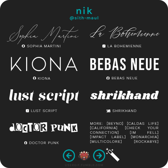
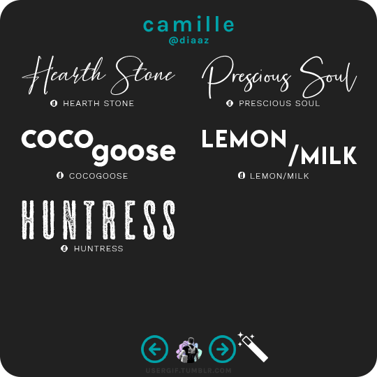
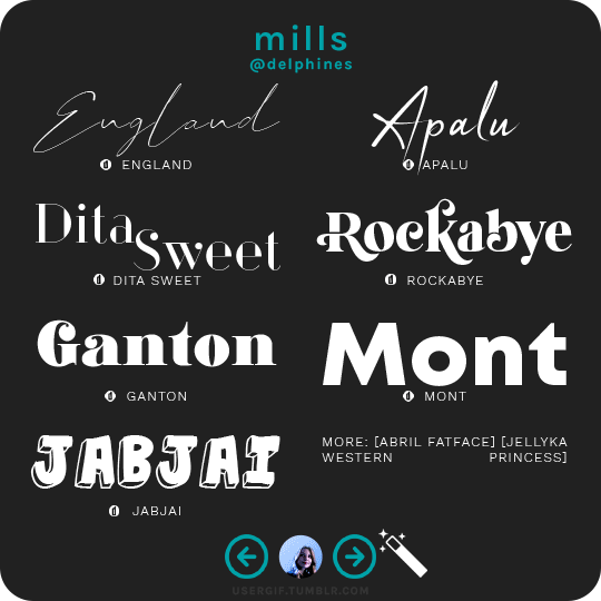
anonymous asked 💬 what are your personal font recs?
USERGIF FONT RECS 🪄 PER MEMBER Here are some of our members’ favorite fonts! Fonts without a source icon are default fonts on Photoshop. Fonts with the source listed as “other” may require a deeper Google search or are only available to purchase, but most fonts are free! TIP: On mobile, slide your finger over the gif to slowly scrub through frames.
MORE RESOURCES FROM USERGIF MEMBERS: — fade-animated text tutorial by nik [@sith-maul] — font compilation by kate [@selinakyle] — font compilation by sole [@fionagallaqher] — font packs + downloads by jennifer [@antoniosvivaldi] — glitching text tutorial by nik [@sith-maul] — moving text tutorial by drea [@sashafierce] — quick text styles tutorial by kate [@selinakyle] — warp text tutorial by drea [@sashafierce] — (all fonts listed below the cut)
Keep reading

HOW TO: Make a Pantone “Color of the Year” Gif
A few people have asked about my Pantone sets which use the “Color of the Year” swatch design. So, here’s a full tutorial with a downloadable template of my exact overlay! Disclaimer: This tutorial assumes you have a basic understanding of gif-making in Photoshop.
Keep reading


CHOOSE YOUR Æ: LOAD_UNIVERSE(WHIPLASH) Unbeatable beat, unstoppable speed. It's unforgettable.
AESPA WHIPLASH (2024) Æ-AESPA MOVING POSTERS [x][x][x][x]