
i do art; sculpture major. She/They. minors dni. i should probably make an art archive somewhere, huh?
276 posts
Its Me Im The Autism
It’s me I’m the autism <3

whittled her a mushroom and tiny spoon. we are the fabled adhd/autism pair your mom warned you about
-
 thalzad liked this · 1 year ago
 -
 fenrir-ferocious liked this · 2 years ago
 -
 mernoid liked this · 2 years ago
 -
 undernewmanagenent liked this · 2 years ago
 -
 gwurgle liked this · 2 years ago
 -
 yourgamemasterthewhiterabbit liked this · 2 years ago
 -
 shortthembo liked this · 2 years ago
 -
 storytellingvibes reblogged this · 2 years ago
 -
storytellingvibes liked this · 2 years ago
More Posts from Storytellingvibes
this is cool as hell. this is the sort of job i want one day lol
Been working on this video for my day job for months! (Photography and then the video compilation).
Just a little behind the scenes video of our Wonder Woman Restoration from the OG Lynda Carter series.
I wasn't there for the beginning or final set up, so please don't judge those pics too hard! My supervisor did her best 😅
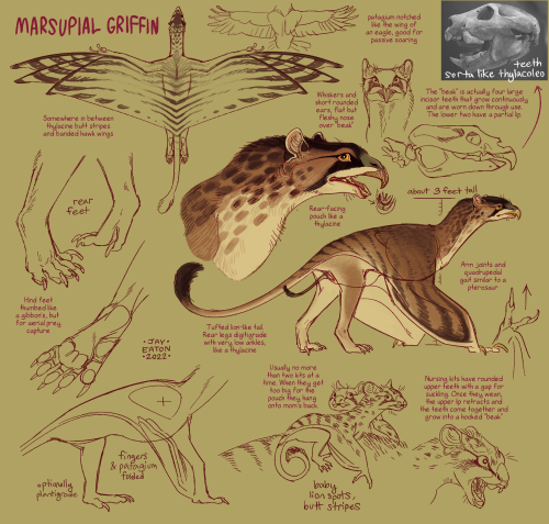
this is my favorite interpretation of a griffin
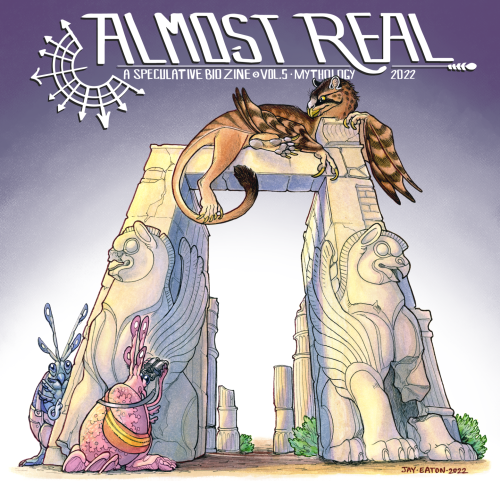
This year’s issue of Almost Real: A Speculative Biology Zine is mythology themed, so I wanted the cover critter to be a weird take on an extremely recognizable legendary beast.
The marsupial griffin is my shot at that, a large flying carnivore with a rear-facing pouch like a thylacine. Its unusual front incisors are continuously growing like rodent teeth, but exposed like a beak— nursing young have a gap in between them, but as they wean into sub-adults the gap closes and the teeth grow to a sharp hook for tearing into meat and carrion. Their thumbed hind feet somewhat resemble a primate’s, but with a set of sharp talons for capturing and gripping prey.
Our cover for this volume was illustrated by @ibenkrutt, who really knocked this design out of the park. If you’d like to support our contributing artists and acquire the zine, you can check out the campaign over here!
https://zoop.gg/c/almostrealvol5

YOU hates terfs
hey you said companion tarot cards usually use really specific and limited color schemes and i was wonder what you mean by that? like what kind of colors or what kind of schemes do you mean?
Hi anon! This is kind of a complicated one so I drew some diagrams : D


From my observations, most of the cards seem to be built on a warm/cold contrast over a spread analogous palette. It’s the ratio of these colours that is important to the overall tone - while some are fairly even analogous, others are instead simply complementary with an accent or even complementary without an accent (e.g. Varric’s lyrium card).
Typically, one colour will come strongly saturated with the other less so, but they will remain within a sort of ‘traditional’ range so as not to look too obviously digital. I would stress the use of hue and saturation gradients and shifts as you paint or fill in your shapes, but the shapes should remain clearly readable as a single colour. Most shadows are also full of colour - for example the ambient occlusion shadows on Hawke’s arms are full of cold greens and warm reds. Blend in some of the opposite cold and warm colours into the highlights and shadows to give the image more coherence where it is painted (this is particularly the case in the Bull/Qunari card).
Bear in mind this is just colour stuff and of course there are a lot of other steps to the cards, but I hope it helps : D Good luck!
gender is a performance and im getting heckled by those old gay muppets