
Hey Friends, Meg Here For WOOPS ITS WEDNESDAY! Today Were Taking A Look At How To Study Values And The
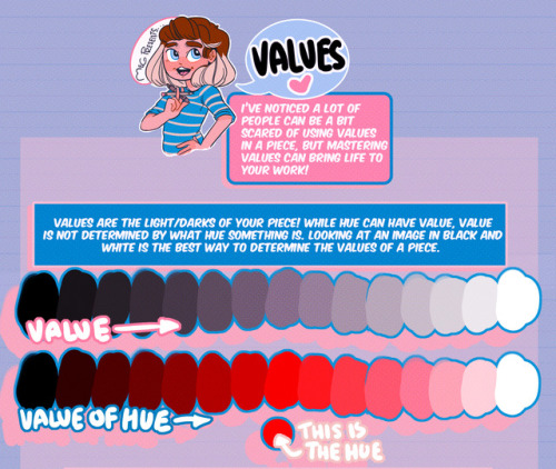
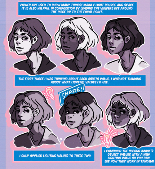
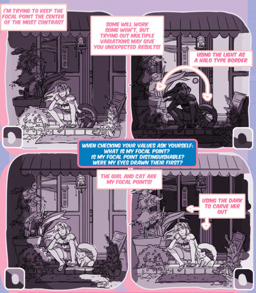
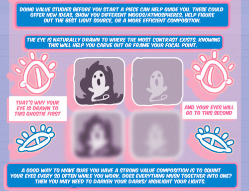
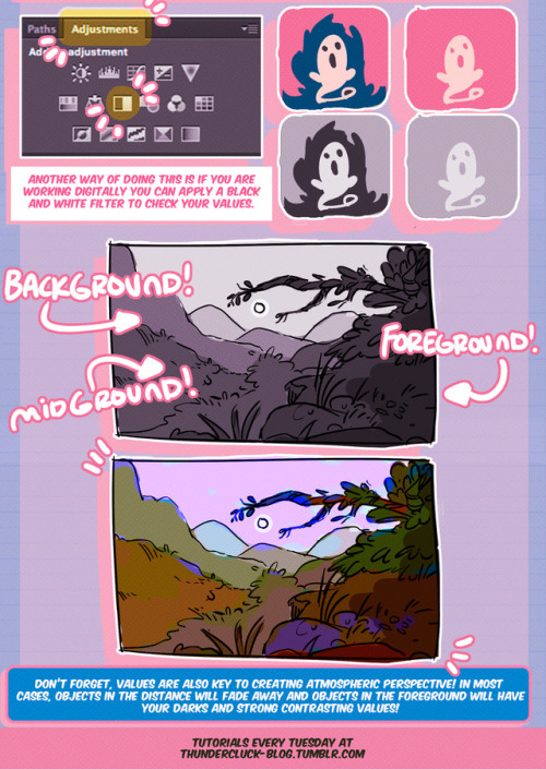
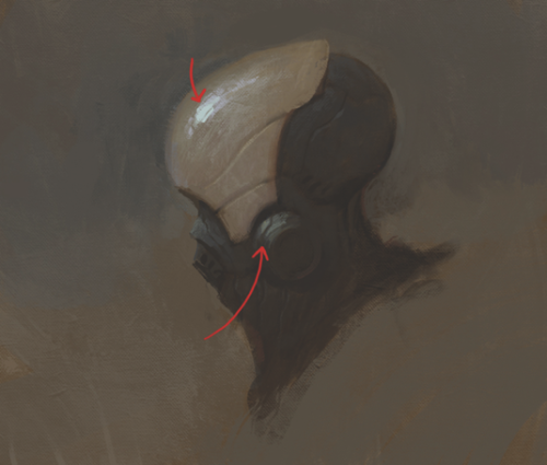
Hey friends, Meg here for WOOPS IT’S WEDNESDAY! Today we’re taking a look at how to study values and the importance of knowing how to use them! It’s not all about color, you know. If you have any tutorial recommendations send ‘em in here or my personal. Now go forth and I’ll see you next week!
-
 wispyarkart reblogged this · 11 months ago
 -
 joynessandlove reblogged this · 1 year ago
 -
joynessandlove liked this · 1 year ago
-
 evilcicierega liked this · 1 year ago
 -
 fredlicity liked this · 1 year ago
 -
 whiskerwheat liked this · 1 year ago
 -
 wabbitears liked this · 1 year ago
 -
 ossumsauce reblogged this · 1 year ago
 -
ossumsauce liked this · 1 year ago
-
 ttrajeudi liked this · 1 year ago
 -
 gratefulcheeses liked this · 1 year ago
 -
 anxietyclam liked this · 1 year ago
 -
 guppy-with-amilkpopsicle liked this · 1 year ago
 -
 imatinyrobot liked this · 1 year ago
 -
 milkpopsicleofdoom reblogged this · 1 year ago
 -
milkpopsicleofdoom liked this · 1 year ago
-
 picievi reblogged this · 1 year ago
 -
picievi liked this · 1 year ago
-
 lesbian-moon liked this · 1 year ago
 -
 swagliostro liked this · 1 year ago
 -
 cl0wnb0yyy liked this · 1 year ago
 -
 black-dog-daggers reblogged this · 1 year ago
 -
 christie-booh reblogged this · 1 year ago
 -
christie-booh liked this · 1 year ago
-
 twerkstallion liked this · 1 year ago
 -
 ellicelovecraft reblogged this · 1 year ago
 -
ellicelovecraft liked this · 1 year ago
-
 jsup reblogged this · 1 year ago
 -
 pyropectic reblogged this · 1 year ago
 -
pyropectic liked this · 1 year ago
-
 apocalyptic-dancehall liked this · 1 year ago
 -
 deepseaphantom liked this · 1 year ago
 -
 k8felge liked this · 1 year ago
 -
k8felge reblogged this · 1 year ago
-
 macehysteria liked this · 1 year ago
 -
 ciaravixen liked this · 1 year ago
 -
 its-ritemeow liked this · 1 year ago
 -
 sovinor1 liked this · 1 year ago
 -
 thoughtfulgalaxytrash reblogged this · 1 year ago
 -
 evilsnootlord reblogged this · 1 year ago
 -
evilsnootlord liked this · 1 year ago
-
 indigoidiot reblogged this · 1 year ago
 -
indigoidiot liked this · 1 year ago
-
 nyeh-vworthashot reblogged this · 1 year ago
 -
 baby-a-in-trenchcoat liked this · 1 year ago
 -
 hiimsuperawkwarddontmindme liked this · 1 year ago
 -
 aychristee liked this · 1 year ago
 -
 blackbirds0608 liked this · 1 year ago
 -
 0klyla liked this · 1 year ago
 -
 juniperize liked this · 1 year ago
More Posts from Artisium


Hey jsyk it’s 2018 and if you’re still drawing characters with big lips like THIS, even if they’re pale/not black, it’s fucking racist. Stop doing it.
No excuses. “It’s a stylistic choice!” It’s a RACIST stylistic choice.
“Idk how else to draw big lips!” That’s because you relied on racist caricatures and are a bad artist. Teach yourself. Learn. If you’re not willing to do that, then you are a bad, racist artist.
“But it’s part of the character design!” Yeah, and it’s racist. If it’s your OC, then change it. If it’s not your OC, make the right choice and draw them with normal looking bigger lips instead of this racist monstrosity.
And if this post makes you uncomfortable because it’s calling you out for stuff you’ve done, good. Fix it. Own up to it. Grow.
If you see this and you’re first thought is to defend this: you are racist. You are part of the problem. Congrats. Now work on yourself and unlearn that.
Firaxis Games’ concept artist Sang Han Sang on how to give your digital art a traditional look and feel. [source]
00. BEFORE YOU BEGIN
Many people have tried using brushes that simulate analogue bristles, but they may not have thought about how the paint is applied. Traditional painters take great care in applying each stroke of paint, which has been thoughtfully blended to the right colour and value on a palette.
Since the digital medium is so fast and forgiving, we tend to dive right in without much thought and noodle around until something happens. I think this leads to muddy colours, and the energy of the initial gesture gets lost.
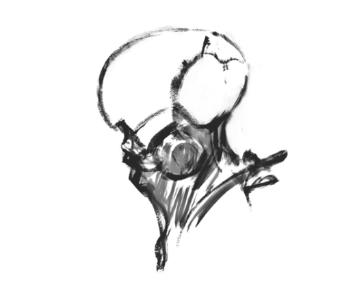
01. SKETCH IT OUT
I begin with a rough sketch, trying to keep it loose and gestural. It’s difficult to think about design, colour, lighting and composition all in one pass so I break it down into steps and keep it simple at the beginning. These early steps are important because not only are they the foundation for an entire painting, but some of these strokes may show through in the finished work.
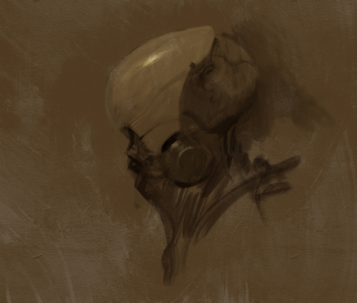
02. LAYER IT UP
Here I create a new layer and change the mode to Multiply. I then paint on this layer with a colour that resembles yellow ochre or burnt sienna. This will help to gauge value and colour more easily than if it was a white canvas. I could have simply filled the layer with a flat colour, but again, the painted strokes may show through and add to the final painting.
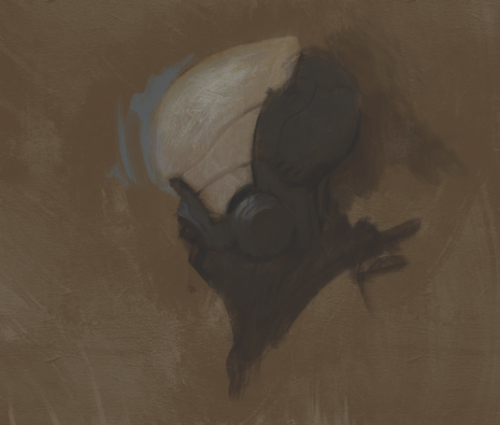
03. RENDERING
In this step, I block in the local colours and start rendering. As I do this, I try to remember not to overly blend or noodle around too much, as mentioned above. One of my goals is to retain the energy of each brush-stroke and put paint down with a sense of conviction. Sometimes I put a single stroke down, undo it and repeat this process many times until I’m satisfied.
04. LEAVE MARKS
Keep in mind that you don’t have to render everything. You’ll notice in traditional paintings, certain details are kept as abstract marks. This adds another level of interest to the viewer. As you get closer to the end of the painting, lay the strokes down with lower opacity to give the effect of thicker paint. I like to do this when rendering certain accents, such as highlights.

this is something I don’t see talked about often when it comes to drawing different body types. sure, weight distribution is a big one, but torso-to-leg ratio affects body types just as much!
For example, I have a longer torso, so high waisted pants rarely reach my belly button and pant legs are always wayyy too long. I’ve stood next to people that were shorter than me, but their crotch was a good 4 inches higher, just because their ratio was way different than mine.
something to keep in mind when designing characters!

Idle posing
Idle posing seems to be a thing most people overlook. But in truth, your character’s idle stance probably holds volumes of information about their character, most likely even more than any other stance they assume. This is because our default stance tells everyone around us about the demeanour, aura and mood we resort to when we’re not appropriating ourselves.
What’s so tricky about these kinds of poses - is how sensitive it is. And how complex the human body communicates. One nudge of the arm, the tilt of the head or curve of the spine can alter our perception of a character’s attitude completely. And sometimes, combinations of such variables can mean that some contributors are neutralized or maybe even switches its meaning entirely.
- Watch theatre. The actors are taught in communicating moods and attitudes to a tee and can give you a very clear look at how the exaggerated mannerisms we see in animated shorts, manifest in human form.
-Sit yourself down and watch old cartoon shorts. Watch how other animators and artists have gone about tackling posing like this.
-Look at yourself in the mirror, observe how subtle the changes are when you swap between poses and moods.

Some quick thumb rules that generally apply ( but can still be reversed or neutralized when used in combination with other mannerisms )
Open posture
Vulnerable parts exposed. Torso open, shoulders back and legs spread apart.
An open posture communicates confidence and courage. A person with an open posture is not afraid to take on whatever challenges come their way.
Closed posture
Vulnerable parts are hidden. Shoulders in tugged in against the torso. Legs close together
A person carrying a closed posture is not as brave and brawny as those with an open posture. They have a tendency to be nervous and can be easily intimidated by some challenges.
Dominant demeanour
Character defaults to literally looking down on others. Either by towering, if they’re taller than the character they’re looking at. Or by glaring up from under their brow if they’re shorter.
These characters hold a strongly dominant aura around them and will seek the upper hand in most situations. Dominant demeanour isn’t necessarily meant to be intimidating but more as a tool for the character to look and feel powerful and in control if coupled with an open posture.
Submissive demeanour
Character defaults to maintaining a direct line of communication between their own and their companion’s face when interacting.
These characters can be perceived as more mellow than those of dominant demeanour. They appear more open and friendly since they’re not trying to impress themselves on you with their physique. They can also come forward as naive and optimistic.
On top of these thumb rules, you got all the variables that can either add or subtract from the intensity of their respective traits.
Variables such as shyness, aggression or aloofness serve as additional hints on a character’s personality. But be careful when you browse for these additional values. Each combination of these gives a completely unique attitude.
Take a look:


Conveying character through their attire
So there are two things to conveying your character through their attire. Well, three if you account for the bit of personality that is by default embedded in their choice of fashion.
Surface values
Let me tackle the ladder first cause it is the simplest one to explain:
If you want to convey that your character likes scorpions or snakes, you slap a snake on them somewhere or otherwise drop aesthetical hints of this particular interest. These are choices made consciously by the character, and should therefore also be treated like so in-universe. This is your character going out of their way to express an interest in a certain topic.
These are the most blatant and ‘easy’ ways to implement personality to your character’s outfit.

Subcontextual values
Where it gets a little more meta is when we start to consider their function, job and social layer, their opinion on norms such as gender and sexuality, etc. Values that contributes to the character’s subconscious. As well as choices made inspired by their lifestyle.
Let’s take a look at the two drawings above ^. The character is obviously the same. But their outfits are rather different.
Both hold an inch of vanity, as it is obvious that the character pays attention to how people perceive him ( note the styled hair, perfectly fitted and spotless clothes ). However one submits itself to a lifestyle heavily influenced by formalities, and proper conduct while the other comes forward as more free-spirited and radical in their attitude. Take a second look at the two outfits. Contemplate how the cuts, rate of coverage and choice of accessories separates the two outfits from one another. And what that, in turn, tells us about the character.
What does he do for a living?
What’re his thoughts of conformity?
Is he a by-the-book person, or more of a happy-go-lucky type?
What materials and pigments are used in the outfit?
Are these expensive pigments and materials?
What does the materialistic quality and style of the outfit tell you about the character’s economic standing?
What ‘s the overall impression you get from the characters physique in combination with the attire?
There are a great many things you can derive from simply looking, and those are just a handful of analytic points you can study when looking at characters ( and humans too IRL )
Meta contextual values
We’ve taken the character’s conscious and subconscious choices into account. Now it’s time to bring our own agenda forward. What do -you- want to communicate with this character. Your OC might have their own tastes and preferences, sure, but did you know that -you- can control the way your audience perceives your character, outside the choices your character makes actively for themselves in-universe?
By fidgeting with the overall shapes present in the outfit ( and character anatomy too actually ), we can provoke psychological responses based on instinctual thought processes and presumptions hardwired into our subconscious. Here’s a quick rundown of those shapes and how they work.


These tropes can, of course, be mixed, matched and used to any degree that you want. Not every production or project makes use of these particular figures by committing themselves 100% to their attributes. But you will frequently see traces of these tropes applied in competent pieces of visual storytelling, as it has proved effective in directing our perception of a character without even having to tell us outright; what their personality is going to be like.
You can also hint at character’s development, by subtly implementing some tropes from one category into the other. Or hint at an underlying character trait that otherwise isn’t communicated by the character’s dialogue or immediate actions.
If you manage to combine both posture, the formalia of outfit design and the meta-contextual design, you’re pretty well set to tell your story to your audience.
I Hope this has been somewhat helpful. It is one of my favourite parts of character design and storytelling - so it felt great to talk about at length again.
- Mod wackart ( ko-fi ) Tristan is property of Studio!Wackart
Quick art tip - child proportions
Ok this is a real quick one but let me show you how to get more-or-less accurate sizes for child characters. Kids are tricky to draw, they are - from toddler up to about teens people change radically almost every year so pinpointing character’s size during those years is pure hell.
What you need to do to make everything super easy for yourself is to check their Head Proportion. What makes kids look like - well, kids, is that their heads are proportionally large in comparison to their body.
Average adult is about 7,5 heads tall in comparison to their own body, however with children under 10 that number is just under 6 heads with about 1 head shorter the younger you go down to 3 heads as an infant.
Easiest way to figure the so-so head-height of a certain age is to find images of said age group and do a quick count on them

at which after you can replicate it in your own works - don’t mind if it’s not 1:1 with reference, finding images that are actually of the age you need is tricky and kids in general vary a lot so someone might be a lot taller than others. You have a bout 0,5 -1 heads of wiggle room before it starts to look way older.


Proportions are super important in art and i lovingly recommend everyone to figure out basics of them - it’s the easiest way to get notifically better with art. I could go on about proportions but let’s wrap this up. Need to note however that head proportion is not same as character height - a character can be 15 feet tall but still have head-height of 6, HH is simply a way to scale out the body.